Black And White: Actually a Grey Area.

Sometimes I include black and white images in my client galleries, and they are often duplicate edits of shots I’ve shown in color. Since most printing services give an automatic black and white conversion option, it may seem unnecessary for me to include these alternate edits. But this is far from the case, and I want to show you how that’s so.

Left: Automatic conversion to black and white from color
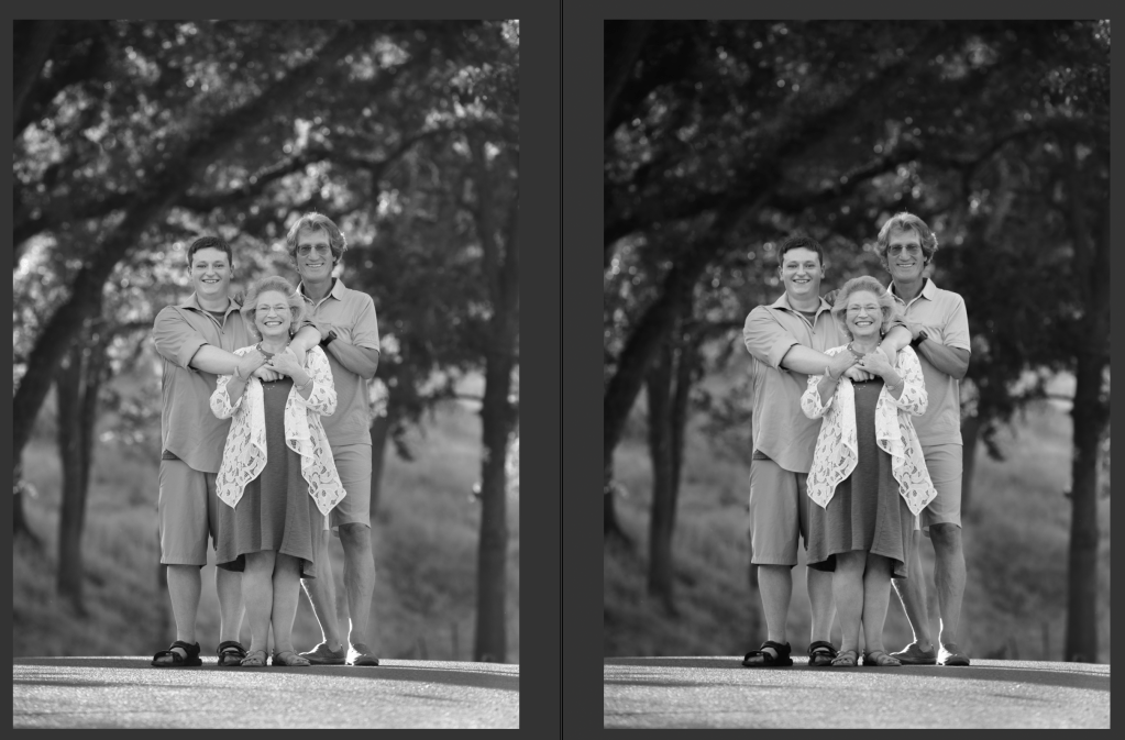
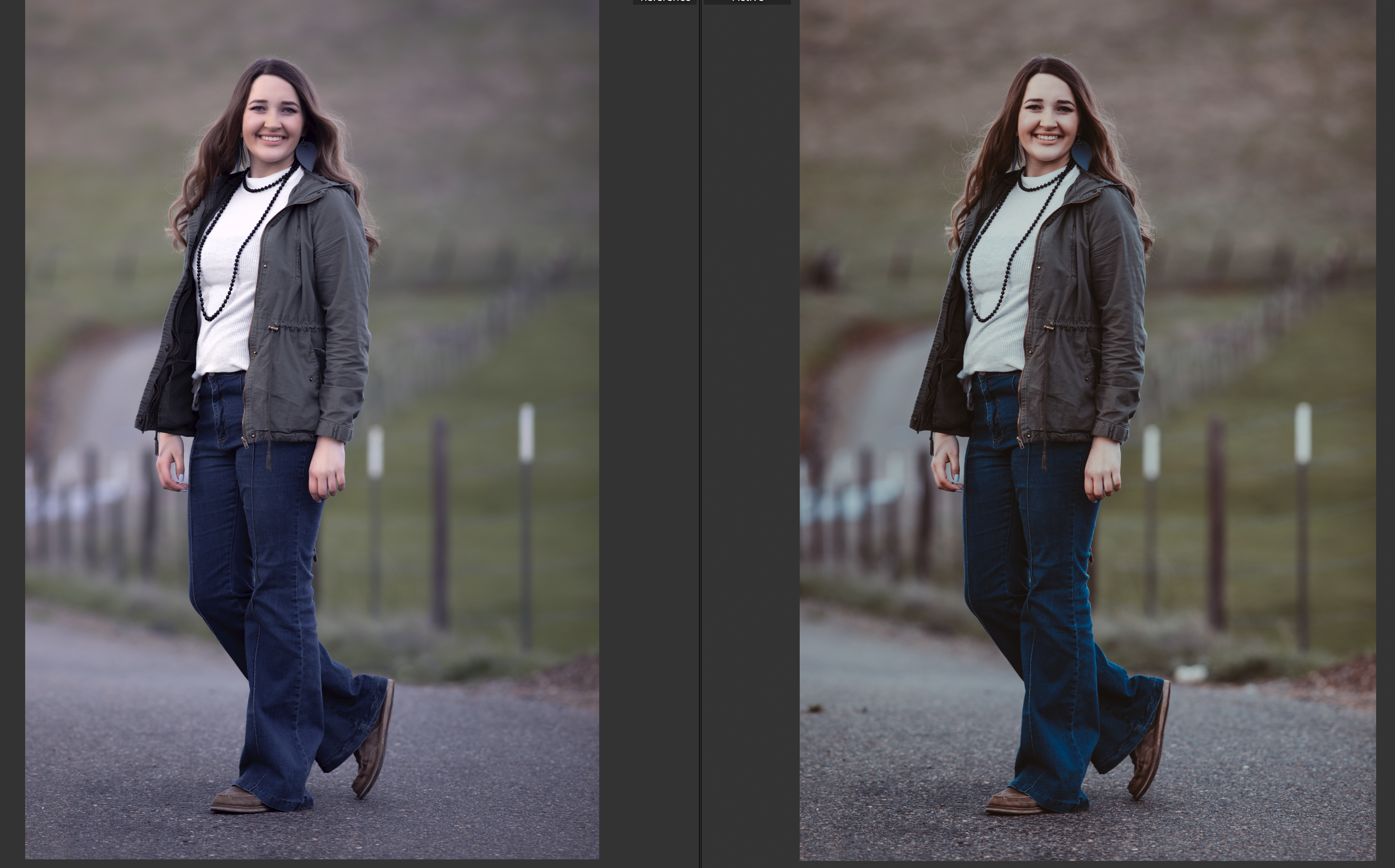
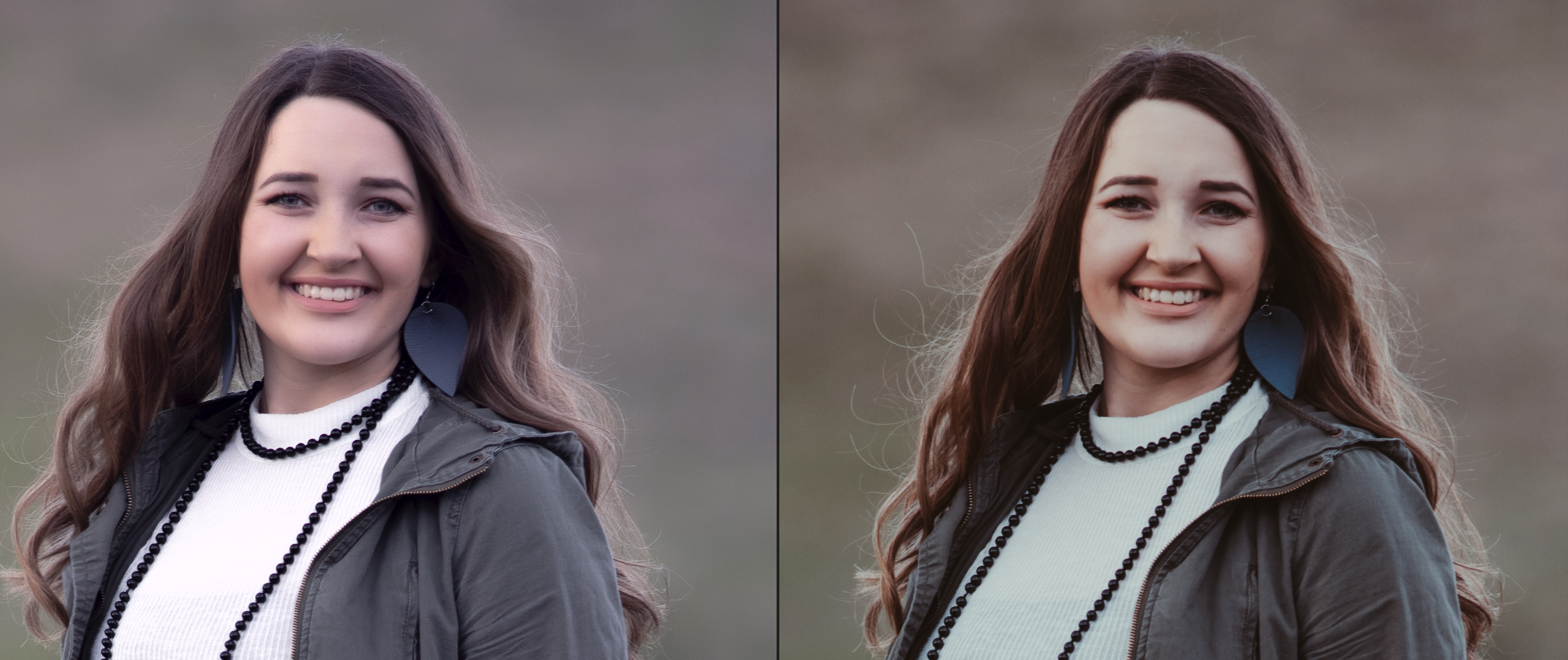
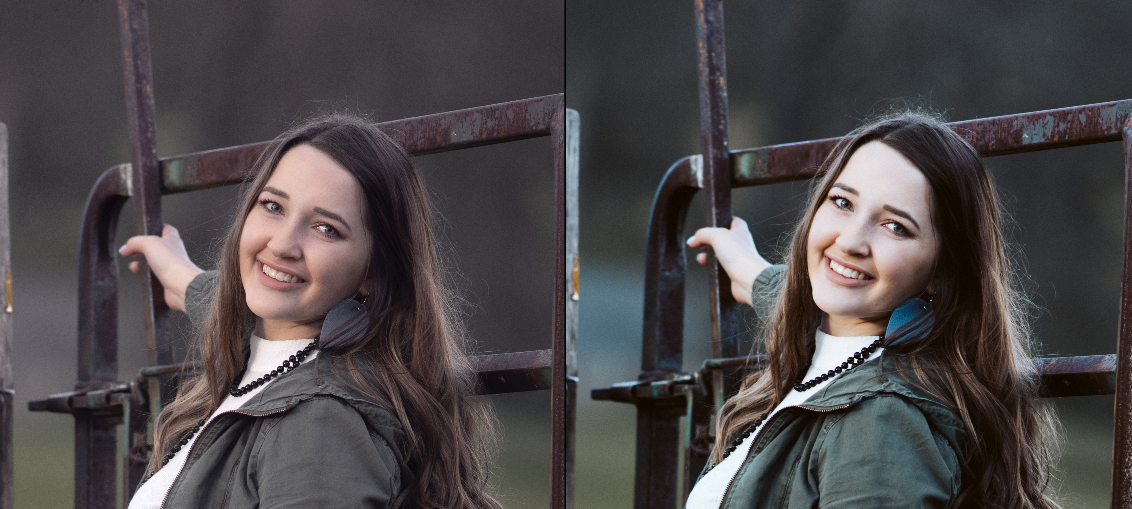
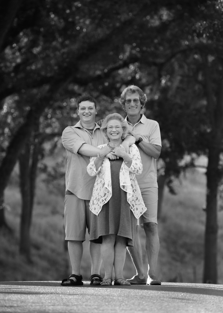
Right: hand-process of a black and white conversion
Original color image

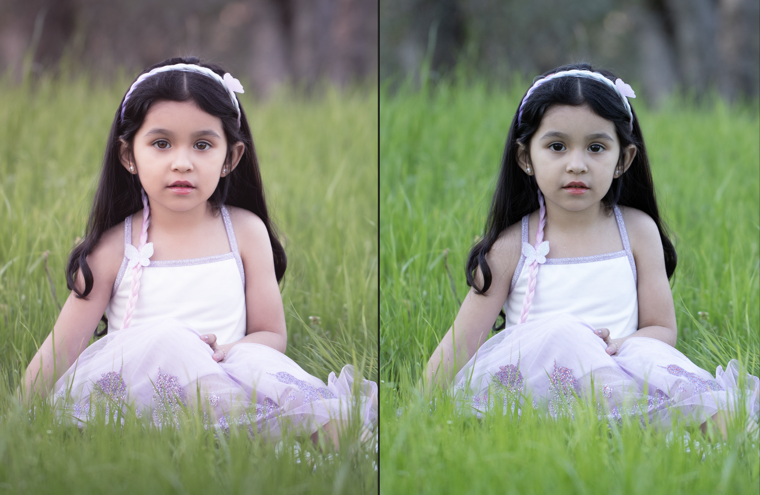
Black and white filters don’t know what you want the image to be about. There are a lot of neat looking effects readily available through Instagram, VSCO, and other plugin sources; but those one-and-done tools don’t understand what is important in the image, and what can be downplayed or augmented to make the subject really pop.

If you desaturate an image and make no other changes, certain details that stood out because of their color will be diminished or lost in your black and white image. Although the colors may have been in great contrast, they may also be very similar in tone. Converting an image like that to black and white can make it all a muddle of similar shades of gray.

A successful, eye-catching black and white image needs to have bright whites and rich darks. It needs to have its subject clearly defined so that even if it’s printed the size of a postage stamp, the subject matter is clear and readable.

Automatic conversion by desaturation–the subjects blend with the background for lack of contrast.

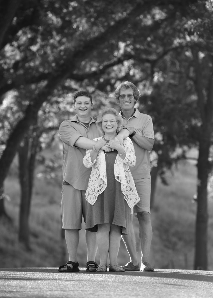
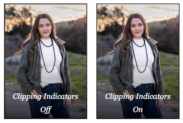
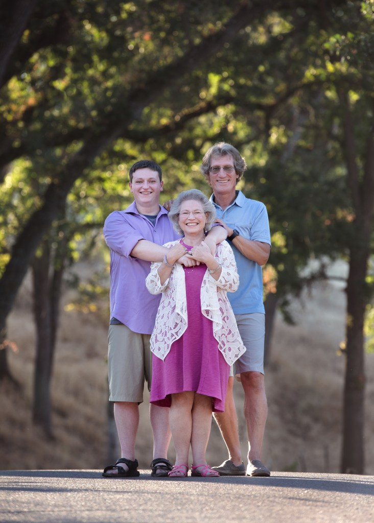
The images I’ve included show the progression an image can take from color to black and white. In the color version, the pink and blue clothing easily sets the family apart from the beautiful greenery in the background. But when I automatically convert the image to black and white (by desaturation), the family seem to merge with the background. Their prominence in the frame is really diminished. Alternately, in my hand edit, I’ve manipulated the light and shadow values to bring the family back out of the background and make them the stars of the show again.

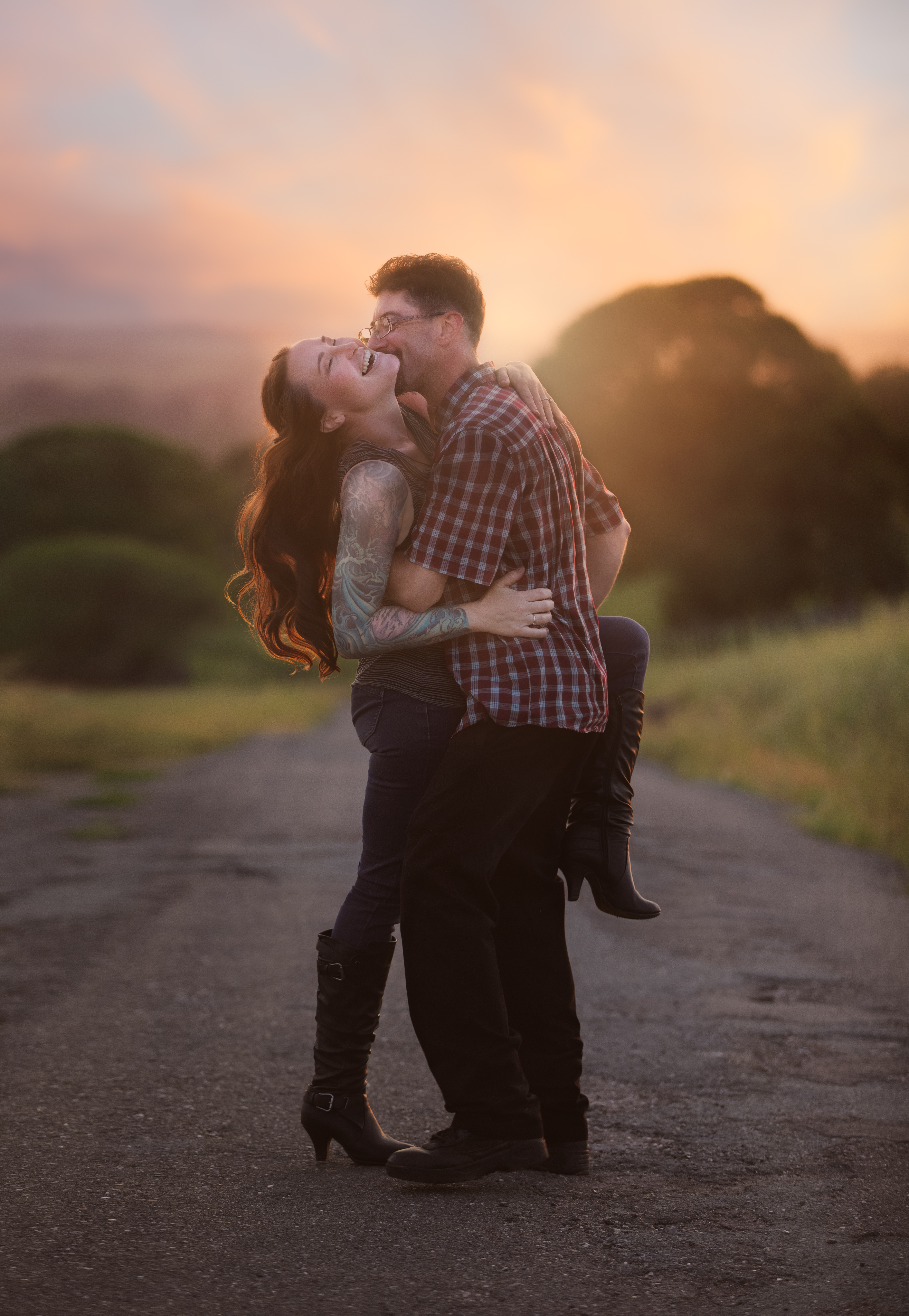
Color spoils easily. The vibrant, on-trend color that makes you love an image today can also make it look dated in 7 or 8 (or 20?) years. Color is very susceptible to the changing tides of fashion, so if there’s a lot of bold color in a shot, that can be a really good reason to also have a black and white edit. Without the element of color, images can transcend time more freely and endure more without the connotation of any particular era. On the other hand, there’s a valid and joyous place in the world for all that is of this very moment and will no longer make sense to us 6 months or a year from now. “Now” and “Always” are equally precious.

Custom hand-conversion from color to black and white–a dark background contrasts strongly with well-lit subjects, and the tones in the clothing are varied.

So, automatic black and white conversion is not available in my product line. I encourage my clients to reach out to me personally for their black and white conversions so they can get a black and white image that is every bit as thoughtfully created as the color version.

The Magic of Processing

I started dabbling in Photoshop for fun in 1997. I was just a kid. Later, in college, I got my first job at the University library. One of my job duties was working in Photoshop to restore damaged historic photos from the library’s collection. At that time, I built the real foundation of the processing skill I bring today. I didn’t get much instruction, but I learned how to layer, how to blend well, and how to fool the eye.

Fast foward a couple decades or so. When I began to sincerely invest in my education as a portrait photographer, with that new formal knowledge based on the foundation of all those years of experience… suddenly, I could see the Matrix. Does that reference date me?! hahaha

But really… Images: they are all. just. pixels. A photo is a painting made out of pixels. Photoshop makes an image into modeling clay in technicolor. You can do anything you want with it. It is such an amazing, sophisticated tool.

I know I talk a lot about processing on my blog, and my experience in that realm is definitely on my A list of skills. But I don’t use processing to make boring images interesting. My goal is to use processing to make amazing images spectacular.

Processing and retouching conversations usually center around “perfecting” a client’s appearance. I do correct the posture and retouch impermanent blemishes, as a mundane matter of course. But to me, the real gold of processing is not about making people thinner or fixing skin. It’s about creating magic.

Straight out of camera.

What if her hair flew up just a little higher and spread out just a little more? What if she had pointed her foot more gracefully when she kicked it up? What if the sunset that night had been more colorful? What if the sun set right behind them instead of off to the right somewhere?

Magic. That’s what.

With magic.

Look for this image at the Amador County fair next week!

Understanding Image Quality: Exposure

What is the recipe for great image quality? How do you know it when you see it? I’ll be writing a series of posts over time to delve into this in a way anyone can understand. The short answer? Great images are made by leveraging adept knowledge on powerful equipment to uplift free-spirited creativity.

I want to take a little time to explain some different aspects of image quality in a way that’s not too technical for non-photographers to follow.

The low-quality samples in my proofing don’t show the depth of detail in the final images. That’s part of the reason I’m writing this post! The image quality I explain here is the image quality you can expect from every one of my galleries. I work in accordance with the standards established for commercial photography by Adobe Stock and Getty Images, and branch out artistically from that starting point. If for some reason I ever couldn’t deliver that on a session, I would offer a complimentary reshoot rather than deliver those images.

Poor Quality: Background
Exposure Issues

There are many factors that make up the prevailing assessment of image quality. In portraits, focus should be sharp on both eyes. Exposure should be correct. The image should be free of excessive artifacts like noise, dust, chromatic aberrations, and color separation. There are times to break the rules, and I’m happy to do it for good reason. But quality standards exist to help us create the most rich, real, and beautiful images the state of our art will allow.

To put it more plainly, here’s a poor quality image. The highlights are clipped–see how the side of the building is white where it seems like it should probably be yellow? Those parts of the image are so overexposed that the camera’s sensor recorded no detailed data. The same thing happened in the shadows here. There are no details in the blacks.

Highlight Clipping: BIG RED NO!

It’s kind of like when you walk into the sun from a dark room and you can’t see anything until your eyes adjust. You’re not capable of seeing both the extreme dark and the extreme light at the same time–you have to adjust for one or the other. In the same way, this scene went outside the range of what my camera could capture.

The next image shows what the same shot looks like to me when I’m processing. The red is Lightroom’s highlight clipping indicator, and the blue is the shadow clipping indicator. I don’t turn these indicators off when I’m working. A quality image should look identical whether they are on or off.

I’ve also shared an example of a successful image side by side with the clipping indicators on and off. There’s no difference between the with and without indicator images. Even though this image was also shot in dramatic light, there is no clipping anywhere–detail was captured throughout the entire frame.

The takeaway is that protecting the quality of the entire frame is essential to making the most beautiful image possible.

Professional photographers not only recognize image quality issues, but they also have in-depth technical knowledge of the equipment they use, and are able to push its capabilities to the limits–or even beyond, with a measure of ingenuity and strong post-processing skills.

Why I Don’t Use Presets

One of my images with a popular preset applied. The white patch on the right is burning my eyes! that highlight was not blown out in the original image.

My feed’s always flooded with ads for photography presets, also known in the social media world as filters. These pre-made sets of editing actions can be mass-applied to a whole photoshoot at once. Some photographers use presets as a tool to save time and give all their work a consistent look.

When a stylized preset is applied, the image can become more about the preset than the actual image itself. For this reason, presets can help increase the impact of images that are lacking in interest or quality. But they fall far short of hand editing when they meet with great image quality and attention to detail.

Clients and colleagues have complimented my processing and asked if presets are a part of my workflow. So, I wanted to take a few minutes to write about my approach to processing, and explain why I don’t use presets.

If you’ve ever followed a photography feed or even talked about photography near your phone, you’ve probably seen preset ads. Brixton film, Jake Olson, who else sells presets? There are so many out there. The example photos look dreamy–bright, rich, deep and intense, or soft, muted, and tranquil. Surreal in a really good way. It’s easy to think that mood was created by the preset alone.

But, no. A professional photographer shot those images, and although the preset was applied, many other actions were also taken to create that final product. When presets are simply applied wholesale, one-and-done style, the effect is not always so dreamy.

Left: My hand edit; Right: a popular preset with no other edits

When I began studying as a photographer, I was incredibly fortunate to have a very patient and technically-minded mentor who taught me in depth how to shoot and edit for the best possible image quality. It was a major milestone for me in my path to begin shooting professionally when I was accepted as a contributor for Adobe Stock and Getty Images–two separate commercial image sources, each with a strict insistence on impeccable image quality. My artistic editing springs from that foundation of technical excellence. I start with a clean image, and branch out to create a little fantasy in my editing without losing that integrity.

Consider the images above. On the left, in my hand edit, I kept the blacks dark and the whites bright, making space for the midtones. I clipped the blacks gently to give a soft matte look. I softened the green but left it a natural hue. I augmented the direction of the light. I removed some distractions from the background and minimized the prominence of the textures in the road and grass. I pumped up her hair and subtly straightened her posture, and I processed her skin first by hand and then by applying my custom look with a sophisticated skin texture algorithm.

Left: My hand edit; Right: the same popular preset as above.

In this detail crop of the same image, you can really see the difference in the level of detail between the hand edit and the image with the preset applied. The preset made her white shirt look blue and her face look orange. Her hair is not flattered, and her eyes are darkened so much that the light in them is almost totally lost. The preset brought out unwanted detail in the background and flattened her face, making it appear more broad. The same broadening and flattening effect can be seen in the preset-applied image below right. The skin tone is unnatural, and popped details in the gate steal attention from her face.

Left: My hand edit; Right: another popular preset–her face is flattened and broadened by detail loss.

I love an artistic, stylized edit, but presets don’t give me that. For my workflow, they remove detail and rob the processing experience of its intention and artistry. There’s nothing a preset can do that I can’t create by hand, which gives me so much more freedom to create.

Left: My hand edit; Right: original image straight out of camera with no edits

Presets do serve as a great reflection of popular culture. In 10 years, we may look back on them with nostalgia the same way we look back now on Glamor Shots, In Living Color, and JNCO pants. SO cool at the time, right? So NOW. It’s not necessarily a bad thing, but the love may not last.

As much as I enjoy being gently swayed by the changing tides of style, it’s important to me that I stay rooted in classic beauty. I want to make sure the work I’m creating will still be relevant and just as enjoyable in 10, 20, or 50 years. And, above all else, I want my portraits to be about the person, not the processing.