Why Do Photographers Hate Pinterest?! (Spoiler Alert: I don’t!)

You can’t do a google search for photographers without getting a few “10 Things Photographers Wish You’d Stop Doing” posts. Naturally, as a photographer, my curiosity gets the better of me occasionally. What are all these horrible things that clients are doing to drive photographers crazy, I wonder? Because my clients have all been freaking awesome.

Occasionally I see valid complaints–of course photographers are heartbroken when our digital images are stolen, or when we realize someone posing as an interested client was really a scammer trying to dupe us. But most of the items I see on the “most hated” lists just look to me like missed opportunities to provide a really top-notch client experience.

I actually Googled “things photographers hate” as research for this post. Can you believe Pinterest was #1?! Priorities, people! lol!!!

I actually Googled “things photographers hate” as research for this post, and Pinterest was the top hit! I skimmed through several posts to get a feel for what the perceived issue is.

My takeaway: it seems a lot of photographers don’t like taking the time to collaborate with their clients because they feel like it threatens their creativity and independence. The photographers writing these pieces seemed to expect a professional understanding of photography from their clients, and they’re annoyed that clients want to follow trends, or might want to create a look that is outside the photographer’s skill set.

Cheesy Selective Coloring
It’s the photographer’s job to be aware of visual cliches
and help clients avoid them.

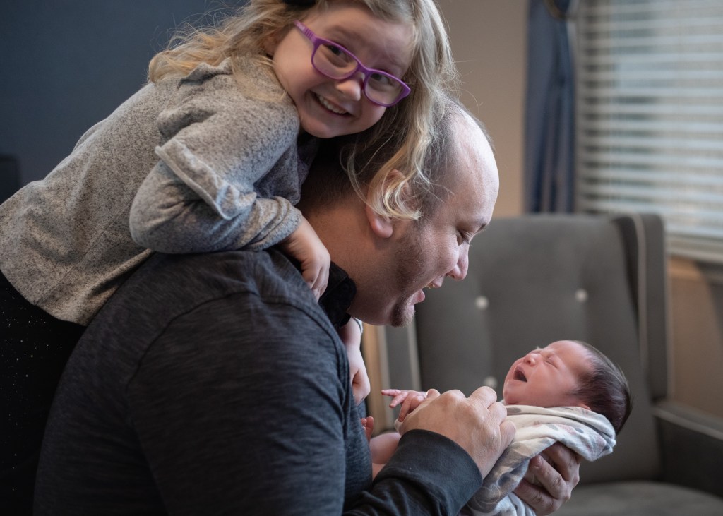
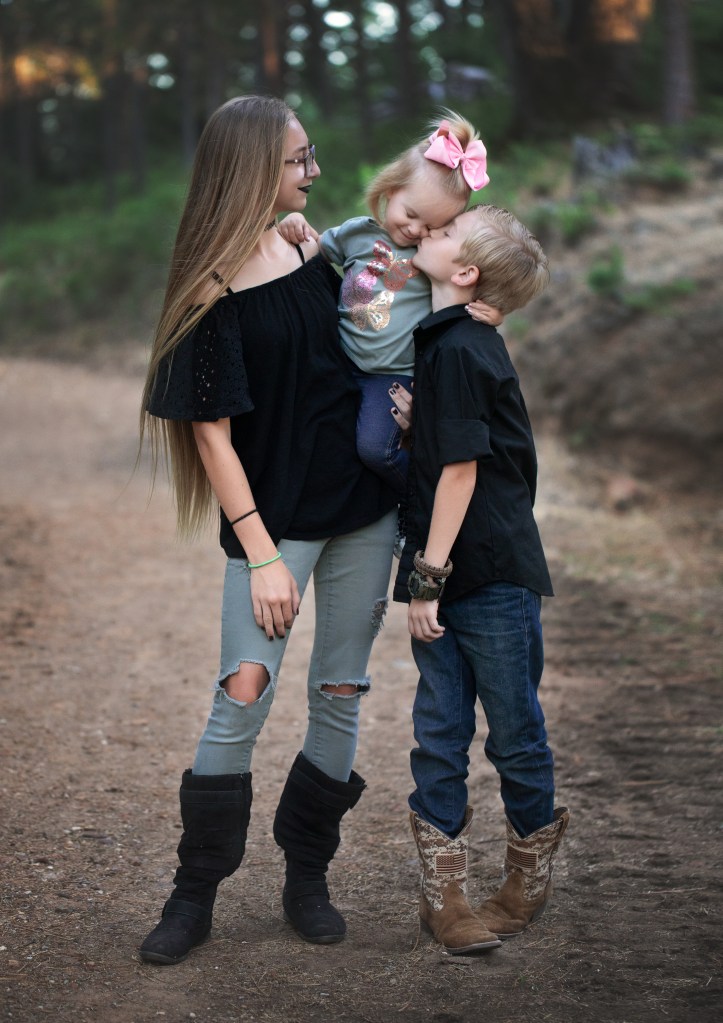
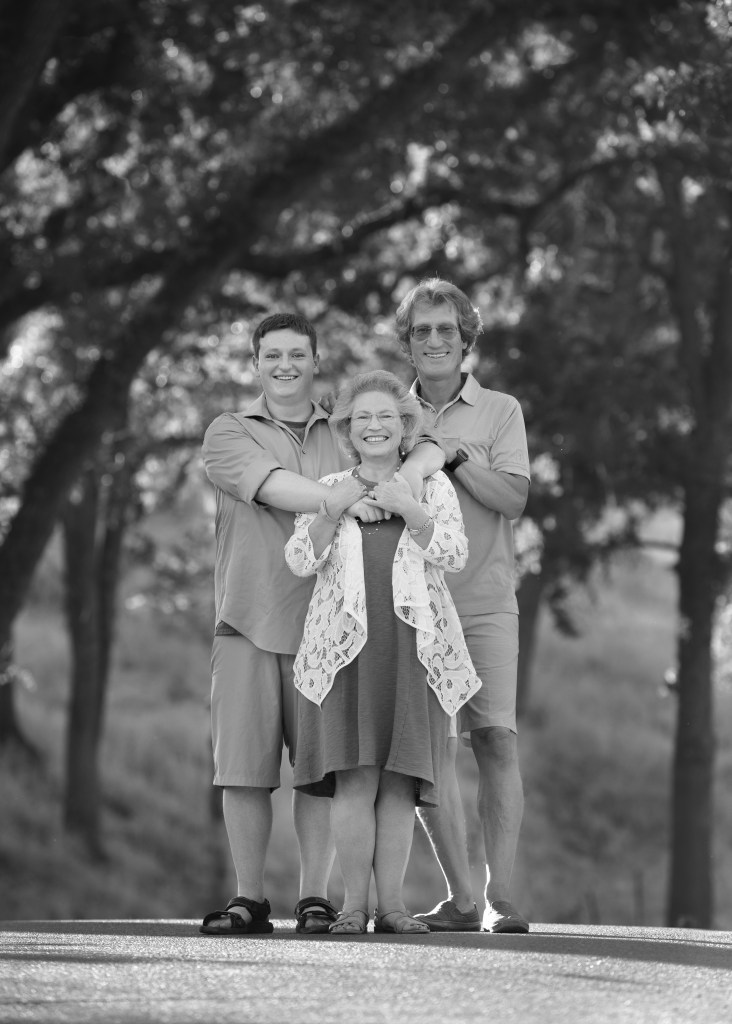
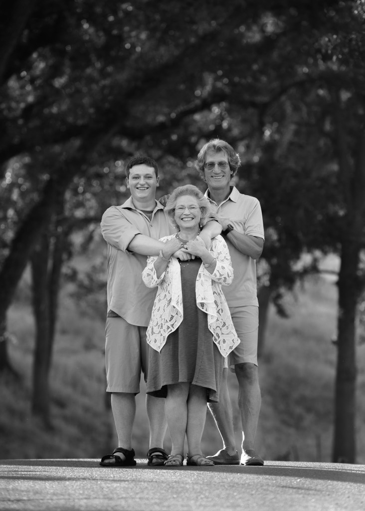
This is all so contrary to what I have in my heart when I work with each of my clients.

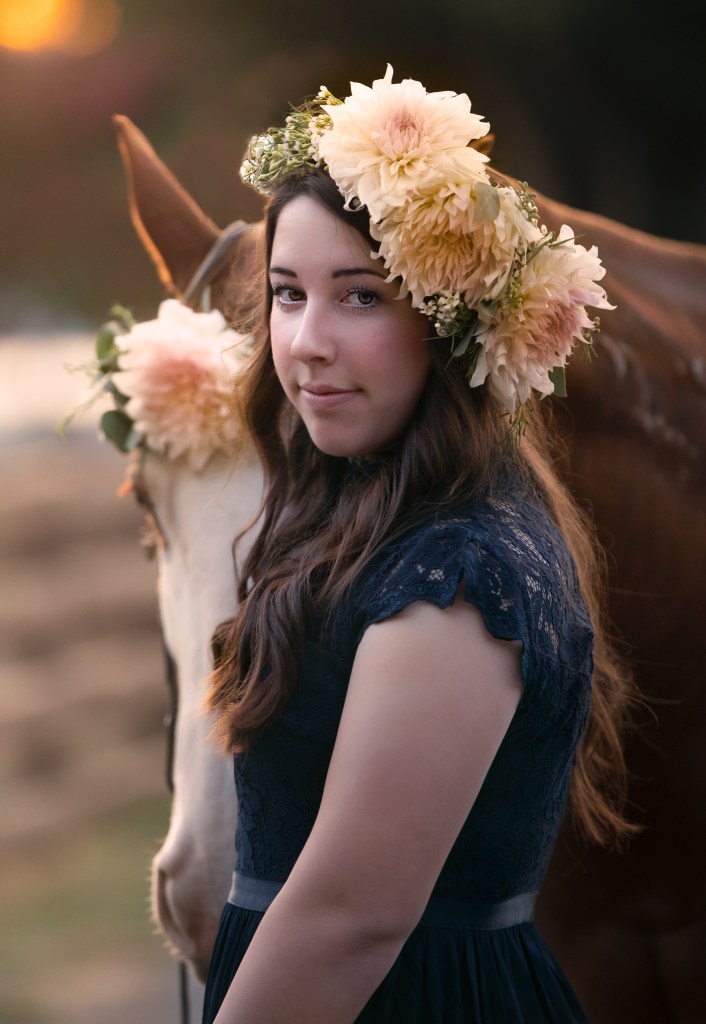
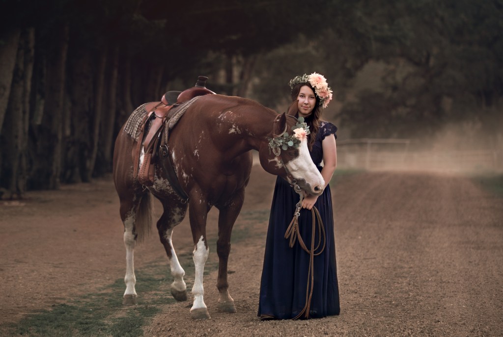
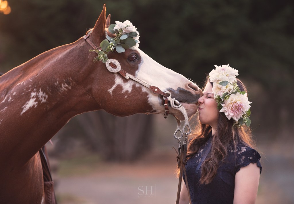
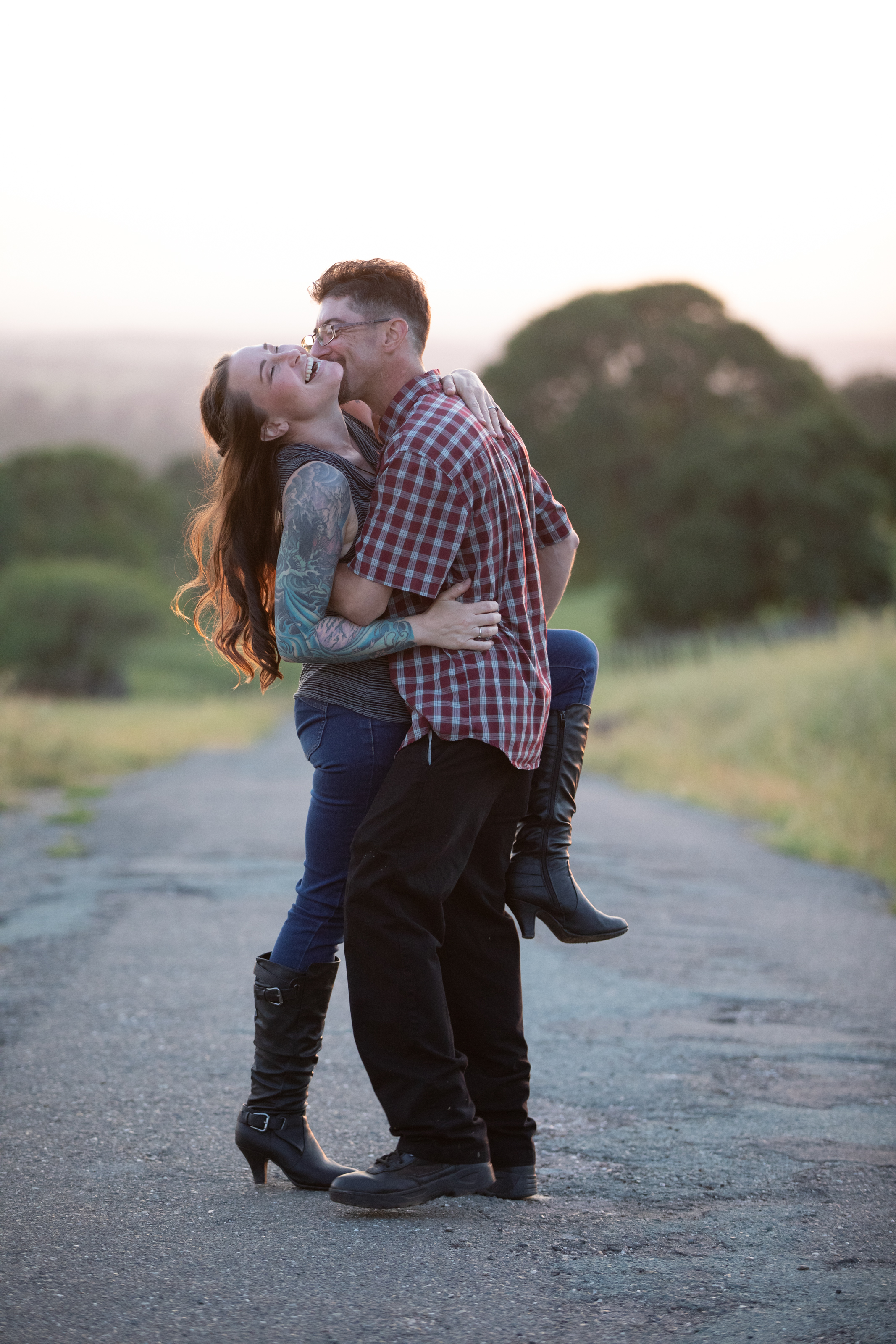
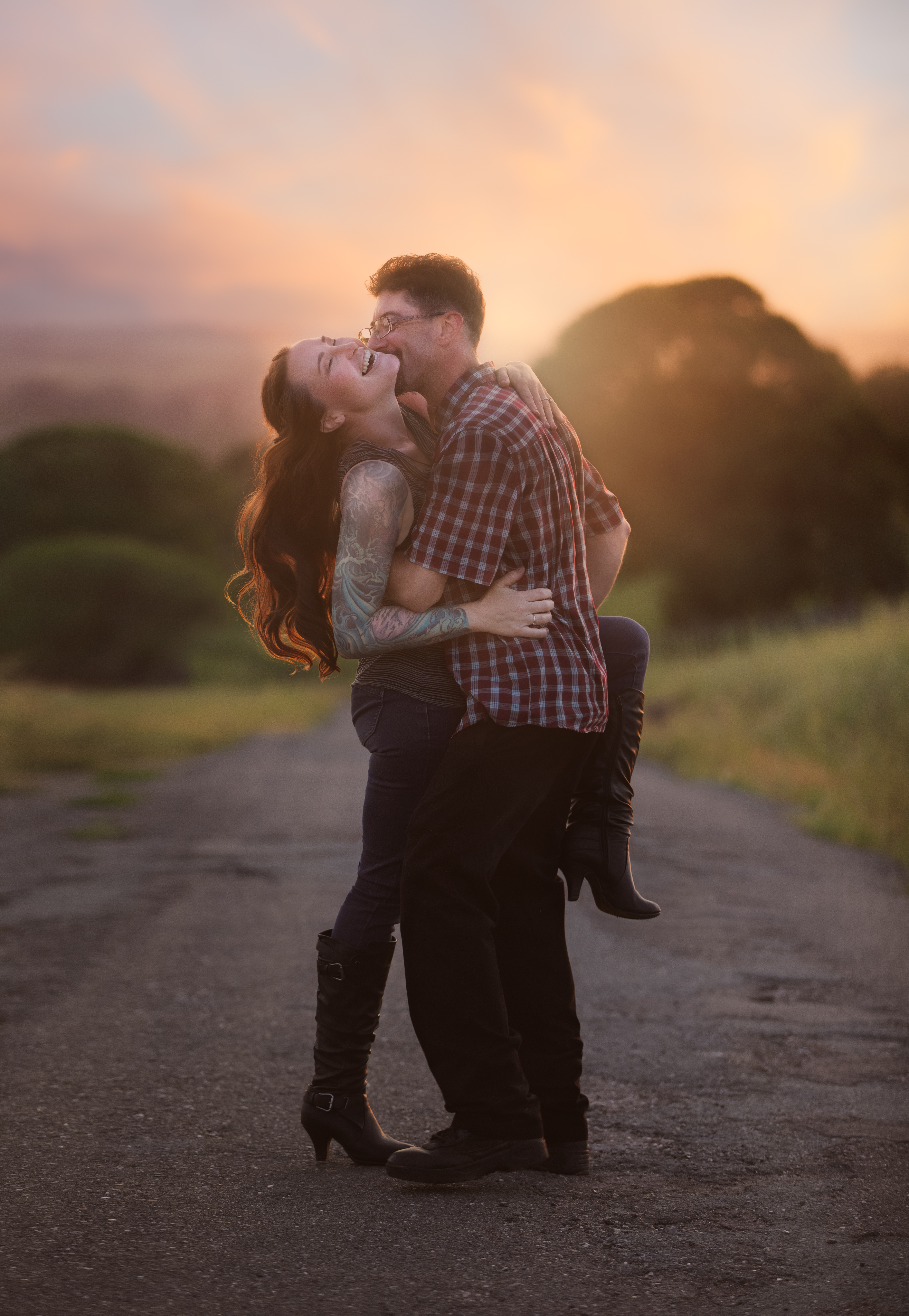
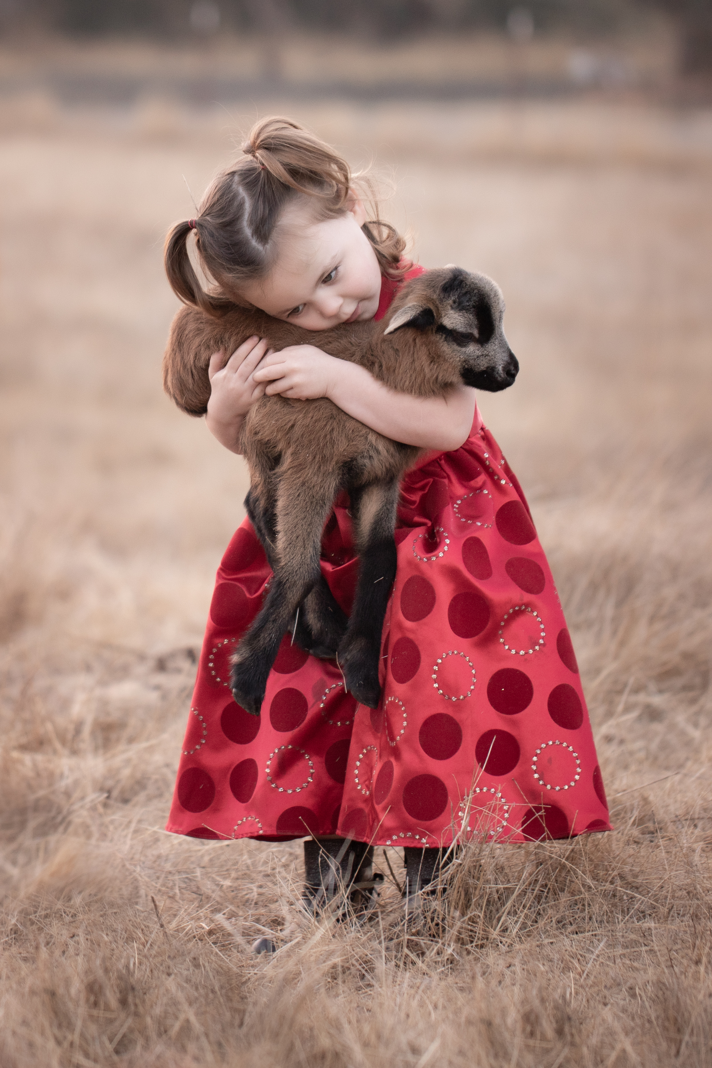
If a client shows me a very trendy image from Pinterest that maybe I’ve seen a million times before, then GAME ON, that is an opportunity to reinvent that look in a new and unexpected way, and be at the forefront of creating our artistic culture. As a professional, it’s my job to be aware of visual cliches and make sure that if we follow a trend, we do it in a way that is fresh, creative, and unique. This knowledge and vision is the reason my clients hire a professional.

I’ve never felt stifled by a client expressing artistic tastes and creative inspiration. I know that my clients come to me because they are drawn to what I do, and they trust me to take their ideas and put my own signature on them.

It’s our job to turn a scene we’ve seen a million times into a one-of-a-kind piece of art.

Another objection to Pinterest I’ve seen a lot from photographers is that although an image might look great on Pinterest, the client may not have the same body type, or it may not be practicable to use a suitable location to match the look.

The idea that I would be expected to literally copy an image hadn’t occurred to me. When clients share images with me, I take that as an inspirational starting point. It’s my job as a professional to see the spirit of the image, find out what it was about it that drew the client’s interest, and find a way to create our own unique piece of art that is inspired by, rather than a copy of, that pinned image.

High key is not my jam. I won’t do this style, but I’ll help you find someone who rocks it if that’s what you’re after!

But what if a client shows me an image on Pinterest that is just very, very far from what I do?

I will say so.

So many of my friends are photographers–I have contacts across all disciplines and styles of photography. If a client has a concept in mind that’s not in line with my aesthetic, I probably know a photographer who specializes in that style. I’ll refer that client along to that other photographer. I love what I do, and I don’t have any insecurity about what I don’t do. I want to see everyone thrive and be able to realize their goals to the fullest, even if that means I’m not in on the project this time.

So, any time, shoot me your Pinterest boards. Tag me, send me screenshots, you name it. Show me what inspires you. It’s a delight to me, and I will never be annoyed or offended by it.


Editorial.

I’ve been obsessed with editorial fashion photography all my life. Bold, fearless photographers like Helmut Newton and Annie Liebovitz captivated my imagination. I was so drawn to the sprezzatura–the effortlessness of their work. It was so peculiar, so edgy or intense, yet looked like it happened that way naturally. It seemed like those photographers were just always in the right place at the right time.

Muse: Allyson Parr

Although the style of my work is night and day from hers, Lindsay Adler’s ethos really resonates with me, and I’ve spent many hours studying her photography lectures. In one of her classes, she mentioned scheduling a creative day once a month to shoot something that is not for clients, but develops your own concepts and creates the type work you really want to sell.

At first it felt indulgent to set “work” aside and plan something elaborate for myself, but I’ve come to realize it’s not just for fun–it’s an investment in my professional development and my brand.

As an artist, I’ve found my most inspired work comes when I collaborate with others. I have a long bucket list of fellow creative professionals whose work sparks my soul. For my last concept shoot, I teamed up with Molly Allen of Made in Amador, who designed a pair of bold dahlia and eucalyptus crowns for my muse and her horse. Made in Amador floral designs have that sprezzatura I love. Molly colors outside the lines. Her pieces have a certain wild abandon to them, yet they always feel balanced and down to earth. Nothing could have brought my vision together more perfectly.

As my business grows ever more booked and my own concepts develop further, I realize it’s quite an effort to put together a styled photoshoot! Although I haven’t hit the once a month mark this year, I I’ve been incredibly energized and inspired by the editorial work I’ve done and I can’t wait to start planning my next project.

How To Get Your Kids to Smile for Pictures

Mom was reading her book in the car.

I’ve noticed parents can get pretty stressed about family photos, and most of the stress seems to revolve around whether the kids are going to behave and smile for the camera. So, I thought I’d write a bit about what you can do before, during, and after your session to make sure your kids do their part and make fantastic pictures.

The real answer is super simple: don’t worry about it–let me handle that.

But that would make a really boring blog post, so here are some things you can do as a parent to make my job easier.

1. Keep the mood relaxed and positive.

You can skip the coercion and threats–that is so 1980’s! Tell your kids you’re looking forward to having a fun session and can’t wait to see what the pictures will look like. You may be a little concerned that they won’t cooperate, but it’s usually best to put your trust in your photographer and assume everything will be awesome. The kids will likely follow your lead.

Start your session with everyone as well-adjusted as possible. Nobody looks good hangry–grownup or otherwise. ‘Nuff said? Since sessions are usually in the late afternoon, it can be tempting to save up appetites for a nice dinner afterwards. For the sake of harmony, it might be better to have an early dinner/late lunch and then go out for dessert when the session’s done.

Mom’s joy was contagious.

2. Follow your photographer’s lead attentively.

Adults are harder to photograph than kids. Read that again.

This counts double in family sessions. To get the most out of your session, put your attention on the photographer rather than on supervising your kids. Experienced photographers have a million strategies for making real smiles shine through. We rely on our communication with the whole family to make your images look amazing.

Even if you’re not in the shot, follow the photographer’s lead. Avoid giving instructions to your kids unless requested by the photographer. Photographers’ visions are usually a mystery until you see the images. Let the photographer set the boundaries when needed.

4. Let them be kids.

Your family portraits should be a beautiful memory of who each of you are right now at this moment in your lives. Your 3-year old is probably a goofball, and that’s ok. No, that’s better than ok–it’s fantastic. Maybe your husband is a little grumpy, for that matter. That’s ok, too. There’s nothing cuter than the moment when a goofy 3 year old forces a grudging smile out of a grumpy dad! Just let everyone be who they really are, because that’s the beauty of your family.

Nothing shuts the magic down faster than a power struggle. Even if kids are acting out a bit, it may be better to address that after the session’s over. Don’t worry about what the photographer thinks. We–for my part, anyway–aren’t looking for perfect behavior; we’re looking for personality.

What could be construed as disruptive antics=priceless moments.

3. Give it time.

Kids are always either a little wild or a little cranky when they first get out of the car. Rather than trying to force them to change their mood instantly, it works a lot better to give them some space to unwind. Let them play for a few minutes (the photographer will love getting some candid shots of them doing their own thing), and once they’ve burned off some restless energy, the posed shots will be a lot more successful.

This is why I don’t recommend mini sessions (I personally don’t offer them at all). I’ve found that the best, most authentic connections and smiles come toward the second half of my longer sessions when everyone is relaxed and natural.

5. Have fun.

Play with your kids! Mood can be contagious, so make sure yours is upbeat and relaxed. Put your worries aside. Have you ever seen an image in your photographer’s portfolio that looked like a hot mess? (If your answer is yes, consider shopping around a little more.) We’ve got you, and you’re going to love what we create.

Keep the takeaway positive as possible, even if you weren’t super impressed with your kids’ behavior. Parenting is personal, but I’d be tempted to say what happens in the photoshoot stays in the photoshoot–just let it go in the interest fostering future goodwill toward photo day. If you were relaxed and following the photographer’s lead, it’s highly unlikely anything they did will spoil your photos.

If you’re laughing and having fun with your family, you’ll bring out their lighter sides, too. Leave the stress to the professionals and enjoy this time of joy and connection.

No “Cheese” was said.

Style Haus by SH

Whoodley woot woot! I just finished putting together my fall look book for sessions! (You can see all the magic here.) I’m so excited about the little micro collections I built. Each one has its own particular style and palette. It’s difficult to describe the ways that color, texture and pattern interact well, so showing is perfect. I’m so thankful to have an Amazon Influencer account that lets me create this amazing resource.

The most important concept to me while I was building these little family collections was sprezzatura–a certain effortlessness of style. I tried to to include an unexpected element in each to make them as utterly unique as each family I meet. I’m not aiming to have someone buy these collections as they are and wear them, although anyone certainly may do. What I really want to do is inspire creativity in a way that introduces some fresh perspective and authentic personality to the family wardrobe game.

Let’s be totally transparent here. Amazon’s Influencer program is all about sales, right? I do get a few pennies in the jar each time someone uses my shop. Some day I might make enough off of this to buy an extra battery for my camera. But I’m not a merchant, I’m a photographer. I’m not doing this to make money on clothing sales. It’s just a phenomenal tool to communicate ideas, and to help my clients plan and get excited for their sessions. It’s like Pinterest, only it’s on Amazon, so if you love something you can just add it to your cart. And most of it is inexpensive. What could be more awesome?!

Anyway, I digress. Here are a few thoughts about dressing your family for your fall session.

First of all, it’s ok to let each individual personality shine through. If everyone has a different style, you can unify the look through color or texture. Don’t worry about your teenager’s eccentricity too much. If one of your kids is a book worm and the other is an athlete, go with it. Everyone doesn’t have to be wearing cookie cutter Sunday Best for the pictures to be fantastic. I tried to show in these little collections how different aesthetics can mix well in the same group. Because every family is a little eclectic, right?

If you’re not formal in your everyday life, there’s no reason to “dress up” for your session. The images will be much more authentic if you dress in a way that’s comfortable to you. Make your look special by adding a bold accessory or two rather than stepping up the level of formality in the clothing itself.

The best way to make a sure-fire success of your family’s look is to choose either a warm or cool neutral palette, and then include a pop or two of one color (bonus if it’s subtle or timely). When I say a pop or two, I don’t mean per person. I mean per group. Only one or two people should have the color on, and the rest should be all in neutrals.

Use pattern with extreme caution. If there will be more than one pattern (even if it’s the “same” pattern, like two plaids), then only one of the patterns should have non-neutral color, and the neutrals need to coordinate.

Of course there are exceptions to every rule, and these aren’t even rules to begin with. The whole point is really to say, “yes, you can use color!” and, “yes, you can use pattern!” as long as you use them in a way that supports rather than detracts from the impact of the people themselves.

So, dive in, enjoy, and share your thoughts with me about the whole process! What do you think of the pattern mixing? What do you think of the style mixing? Would you do it?

Style Haus by SH: Gold Country Fall Look Book

Perception, Self, and the Theory of Forms

Plato explored the notion that all things exist as copies of their ideal forms–theoretical blueprints of sorts. I imagine this is something people have mulled over in various forms throughout human history. As Plato’s ideas developed over time through the lens of other minds’ eyes, it became more common to think of these universal forms as ideas, and less common to think of them as actual objects existing on another plane of reality.

I read about Plato and his Theory of Forms when I was young, and it brought my attention to how I tend to perceive the world based on ideal forms, sometimes at the expense of reality. This is especially interesting when applied to my perceptions of people, and this may be why artistic portraiture is so compelling to me.

When I think about the people around me, I see their essence first. I’m very aware of the core of their selfness. People’s actual physical aspects are secondary to me, by a wide margin. I often find myself surprised when I see a photograph for the first time of someone I’ve only met in person. The photograph will look so different to me than the person I met. Without the actual personhood present, I notice a lot of the physical characteristics for the first time. Kind of strange? It feels strange.

Normal or not, this mode of perception informs how I shoot and process my own photography. This is my lens. I want to photograph who a person is much more than I want to photograph what a person looks like. This can be tricky sometimes, but I find it’s actually easiest with people who say they hate pictures or that they’re not photogenic. I find that those people don’t have a practiced barrier in place for me to get through before I can see who they really are.

When I’m processing, I’m looking to take away anything that distracts from who that person is at the utter depth of the soul. I want everything around that person to support the message, “look how amazing this person is.” There are a lot of little physical distractions we all deal with day to day. Many little details deviate from what we would consider our ideal form of self; but who we really are is our ideal, and that’s what I see when I look at people. I think of people at their best, and I create that image from my own perspective.

Seeing your own self this way is transformative.

When a portrait is about who a person is, it can’t help being beautiful–it really can’t. We’re all weird in our own particular idioms, and that is utterly fascinating. So if there’s one thing you can take away from this read, and especially from your session if I ever get the honor of working with you, it’s this: you–the real you, as you are–are just what you should be, and you shouldn’t be anything else.


Understanding Image Quality: Digital Image Sizes and Resolution

Image resolution, aspect ratio, and file size can be confusing. This guide will use examples to help you understand what it means when a digital image has a description like “4×6 resolution” or “full resolution.” I’ll also explain how print sizes differ, and how different aspect ratios can change the look of an image.

This Digital Resolution Guide shows each of the digital resolutions I offer my clients. Note that for digital files, I don’t change the shape of the image to match the exact proportions of the standard print size; I simply resize the image based on the long edge and leave the original aspect ratio (shape) intact.

Compare this to the Print Size & Ratio guide. You’ll notice that with prints, it’s not only the size, but also the shape, or aspect ratio, of the image that changes. An 8×10 print is more short and stout in shape than a 5×7, and a 4×6 is the most tall and skinny of all.

Although my camera natively shoots in a 4×6 (2×3) ratio, the actual aspect ratio of the images will vary based on how they’re finished. When printing, always check the crop of your images to make sure the necessary trimming looks ok. You might need to choose a different size print to get the best look from your image.

The proofs you see in my proofing galleries are the smallest versions of all–just about 18% of the original file size. Low-resolution proofs allow clients to preview their images before purchase while protecting my investment in my work. Here’s a direct comparison of a proof and a full-resolution image.

Can you even find that tiny proof in there?! It’s right below the flash on the right.

This really shows the staggering difference in quality between the different image resolutions. 4×6 digitals are about 25% original size; 5×7 are about 35%; and 8×10 are about 50%. Full resolution images print beautifully at any size, and still look impeccable at 100% zoom. They preserve every detail exactly the way it was finished in my studio.

Black And White: Actually a Grey Area.

Sometimes I include black and white images in my client galleries, and they are often duplicate edits of shots I’ve shown in color. Since most printing services give an automatic black and white conversion option, it may seem unnecessary for me to include these alternate edits. But this is far from the case, and I want to show you how that’s so.

Left: Automatic conversion to black and white from color
Right: hand-process of a black and white conversion
Original color image

Black and white filters don’t know what you want the image to be about. There are a lot of neat looking effects readily available through Instagram, VSCO, and other plugin sources; but those one-and-done tools don’t understand what is important in the image, and what can be downplayed or augmented to make the subject really pop.

If you desaturate an image and make no other changes, certain details that stood out because of their color will be diminished or lost in your black and white image. Although the colors may have been in great contrast, they may also be very similar in tone. Converting an image like that to black and white can make it all a muddle of similar shades of gray.

A successful, eye-catching black and white image needs to have bright whites and rich darks. It needs to have its subject clearly defined so that even if it’s printed the size of a postage stamp, the subject matter is clear and readable.

Automatic conversion by desaturation–the subjects blend with the background for lack of contrast.

The images I’ve included show the progression an image can take from color to black and white. In the color version, the pink and blue clothing easily sets the family apart from the beautiful greenery in the background. But when I automatically convert the image to black and white (by desaturation), the family seem to merge with the background. Their prominence in the frame is really diminished. Alternately, in my hand edit, I’ve manipulated the light and shadow values to bring the family back out of the background and make them the stars of the show again.

Color spoils easily. The vibrant, on-trend color that makes you love an image today can also make it look dated in 7 or 8 (or 20?) years. Color is very susceptible to the changing tides of fashion, so if there’s a lot of bold color in a shot, that can be a really good reason to also have a black and white edit. Without the element of color, images can transcend time more freely and endure more without the connotation of any particular era. On the other hand, there’s a valid and joyous place in the world for all that is of this very moment and will no longer make sense to us 6 months or a year from now. “Now” and “Always” are equally precious.

Custom hand-conversion from color to black and white–a dark background contrasts strongly with well-lit subjects, and the tones in the clothing are varied.

So, automatic black and white conversion is not available in my product line. I encourage my clients to reach out to me personally for their black and white conversions so they can get a black and white image that is every bit as thoughtfully created as the color version.

The Magic of Processing

I started dabbling in Photoshop for fun in 1997. I was just a kid. Later, in college, I got my first job at the University library. One of my job duties was working in Photoshop to restore damaged historic photos from the library’s collection. At that time, I built the real foundation of the processing skill I bring today. I didn’t get much instruction, but I learned how to layer, how to blend well, and how to fool the eye.

Fast foward a couple decades or so. When I began to sincerely invest in my education as a portrait photographer, with that new formal knowledge based on the foundation of all those years of experience… suddenly, I could see the Matrix. Does that reference date me?! hahaha

But really… Images: they are all. just. pixels. A photo is a painting made out of pixels. Photoshop makes an image into modeling clay in technicolor. You can do anything you want with it. It is such an amazing, sophisticated tool.

I know I talk a lot about processing on my blog, and my experience in that realm is definitely on my A list of skills. But I don’t use processing to make boring images interesting. My goal is to use processing to make amazing images spectacular.

Processing and retouching conversations usually center around “perfecting” a client’s appearance. I do correct the posture and retouch impermanent blemishes, as a mundane matter of course. But to me, the real gold of processing is not about making people thinner or fixing skin. It’s about creating magic.

Straight out of camera.

What if her hair flew up just a little higher and spread out just a little more? What if she had pointed her foot more gracefully when she kicked it up? What if the sunset that night had been more colorful? What if the sun set right behind them instead of off to the right somewhere?

Magic. That’s what.

With magic.

Look for this image at the Amador County fair next week!

The Relish Store

I’m very excited to announce that I’ve been invited to participate in Amazon’s Influencer program. This is a HUGE deal for my quality of life, you guys. HUGE. And it’s going to make styling sessions a lot less work for my clients, too.

I always try to collaborate with my clients for wardrobe, and I spend countless hours scrolling Amazon since that seems to be the most universal and affordable option for most people. I have a lot of idea lists on my Amazon account. I. Mean. A. Lot. And there’s not really any easy way to share or present those ideas as a whole.

Now that I’m an official Amazon Influencer, I can have my own curated Amazon storefront. Rather than constantly searching though everything for what I think a client might like, I can just show my clients *all* of my ideas in an organized set of boards. There is a small commission for any sales made through my account, which is just icing on the cake. Really, I’m so excited for the collaboration opportunity.

You can see my storefront here:
http://www.amazon.com/shop/relishphotography

One big thing on my to do list is creating whole family outfits, because that’s something I know clients really stress over. I’ve established wardrobe boards for women, men, boys, girls, babies, and newborns. I also have a section for photogenic toys you can surprise your little one with at your session to help get them liking the idea, and I’m going to make special collections based on style and theme.

My American Summer 4th of July shop is my first themed pop-up, and I’m so in love with all of it. My 4th of July sessions will feature a beautiful handmade wood flag by Patriot Woodsmiths and other rustic props in a beautiful setting. I can’t wait to see these images! Shop my 4th of July picks here:

https://www.amazon.com/shop/relishphotography?listId=2XP6HSO8PMFC5&ref=cm_sw_em_r_inf_list_own_relishphotography_dp_DJViBar5KzlHn

As always, and even more so now, I’m so excited for the future of this grand adventure.


Working With Kids And Animals

“Never work with kids or animals”…said so many people, always, forever…..

But kids are my wheelhouse, and there’s nothing cuter than kids with animals! I see their point, though. Kids=chaos. Animals=chaos. Kids x Animals = whoa…….

Sessions with kids and animals can be super cute and fun! For little kids though, it can end up being more of a lifestyle session than portraits. That’s fine if it’s what you’re after! I’ve been enjoying doing some animal composites this season though, and I’m finding the results are sometimes a bit more magical than the real deal could have been.

girl and rabbit meet at sunset
Could this kind of calm, thoughtful interaction really happen outside of fairy tales–no less in front of an audience of kindly coaching parents and an imposing camera lens?

I shared this image (the girl in the yellow dress) on the Relish Facebook page, and I received a handful of requests for similar shoots. Folks were disappointed when I told them, “yes we can do this, but just so you know, there wasn’t really a bunny at the shoot!” I get it–it’s a super cute thought to see your kids get to play with a real bunny and have pictures of that. But in reality, that situation can be more stressful than cute. A real bunny can easily get scared and run away. She needs careful, gentle treatment, and may get nervous and nibble fingers or have an accident on that beautiful little dress. When real animals are in the shoot, I find that tensions can run high.

With a real bunny, we had to be confined to make sure she didn’t get lost, and both bunny and child were in constant motion. Daddy was trying to keep Evi from standing up and the bunny from jumping out of the wagon.

My daughter got a bunny this spring and I wanted to do a photoshoot for Easter. I made a nice flat spot in a grassy planter for her to hold the bunny. I set up my reflector. But I put her in the grass and she pitched a fit. She didn’t want to sit in the planter. The bunny climbed up the grass and wanted to chew on the tree bark. It was not picturesque. Plan B was putting them both in the wagon–not my vision for a nice color palette, and I had to quickly improvise the backdrop by changing my angle to something less than ideal. The bunny ate grass, and Evi petted her. It was cute. Super cute.

But these shots have barely a hint of the aura of wonder I was able to create in that first image, where I didn’t have to worry about the bunny escaping, and the little girl could be given a simple task without being distracted by the erratic activity of a live animal.

I asked that sweet little girl to look for ants in the bright yellow leaves that the sun was backlighting. She was calm. It was mellow. When I got home, I saw that shot and thought “that’s a perfect spot for a bunny!” …I had a perfect pose from her, and I was able to blend in a bunny in a perfect pose, in a perfect position.

I love this lifestyle image of a little girl with her new baby sheep. Images like this have more of a documentary feel, and are a lot more difficult to achieve with smaller animals.

So… yes, we could bring a bunny out for little kids’ sessions. I do have a real bunny, and she’s super sweet and friendly. But it wouldn’t be very fair to that timid little creature. The reality of live animals in a session is a lot more chaotic and less picturesque than it plays out as in the mind’s eye. I’m not saying I’ll never do it–I gladly will any time if folks have their own animals they’d like to include! But to make something like the really magical composite above, I need to be able to have more control than a real “kids x animals” experience can usually give.

Even when the animal really was at the session, those shots are also often composites. The animal and the child so rarely do the right thing at the same time that I often blend multiple shots to create one final image. With over 20 years’ experience with Photoshop and photography, I can create a full composite that is even more magical, and nobody has to get tinkled on.