Understanding Image Quality: Digital Image Sizes and Resolution

Image resolution, aspect ratio, and file size can be confusing. This guide will use examples to help you understand what it means when a digital image has a description like “4×6 resolution” or “full resolution.” I’ll also explain how print sizes differ, and how different aspect ratios can change the look of an image.

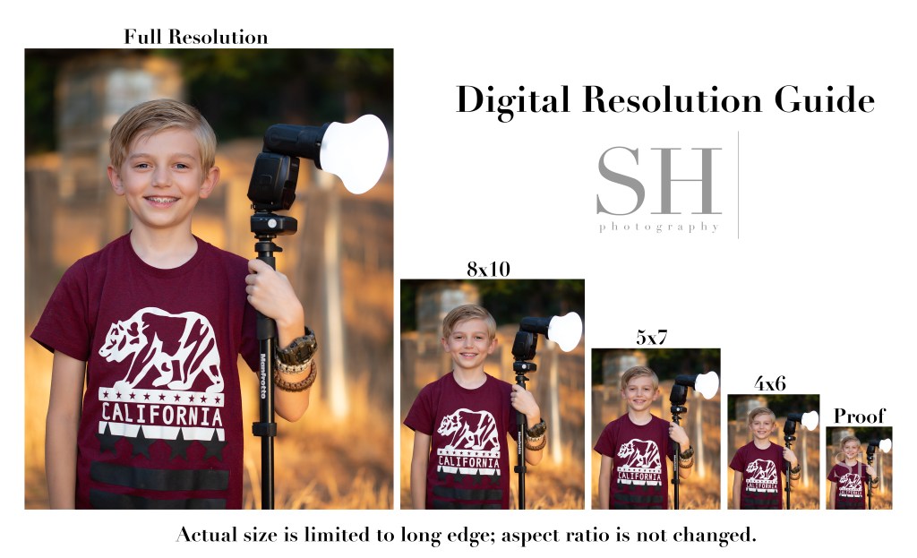
This Digital Resolution Guide shows each of the digital resolutions I offer my clients. Note that for digital files, I don’t change the shape of the image to match the exact proportions of the standard print size; I simply resize the image based on the long edge and leave the original aspect ratio (shape) intact.

Compare this to the Print Size & Ratio guide. You’ll notice that with prints, it’s not only the size, but also the shape, or aspect ratio, of the image that changes. An 8×10 print is more short and stout in shape than a 5×7, and a 4×6 is the most tall and skinny of all.

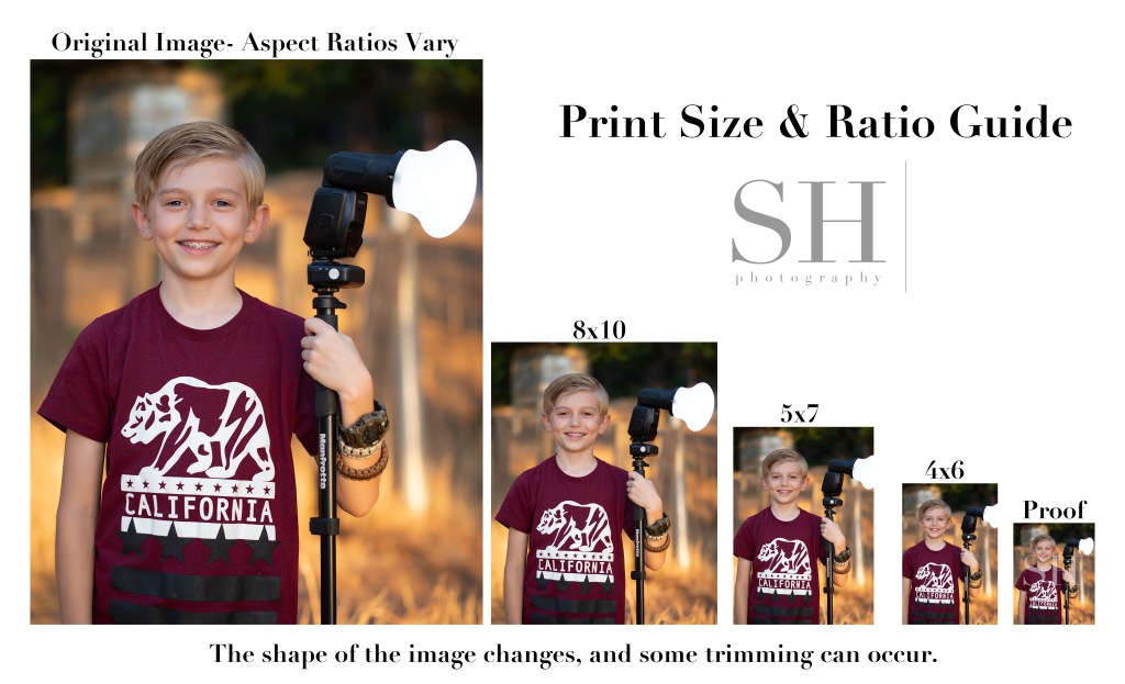
Although my camera natively shoots in a 4×6 (2×3) ratio, the actual aspect ratio of the images will vary based on how they’re finished. When printing, always check the crop of your images to make sure the necessary trimming looks ok. You might need to choose a different size print to get the best look from your image.

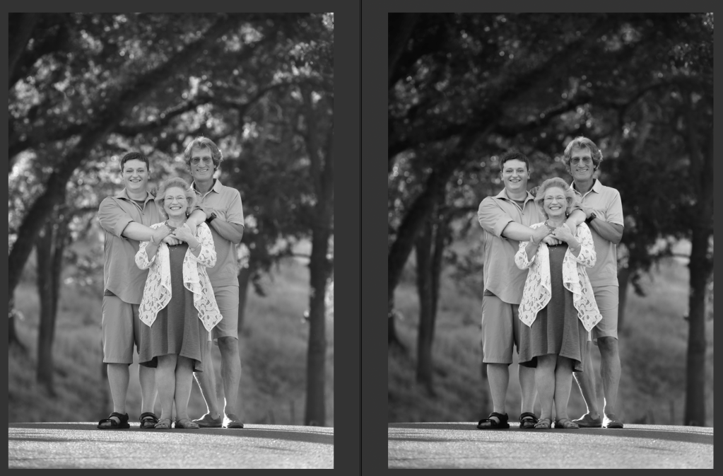
The proofs you see in my proofing galleries are the smallest versions of all–just about 18% of the original file size. Low-resolution proofs allow clients to preview their images before purchase while protecting my investment in my work. Here’s a direct comparison of a proof and a full-resolution image.

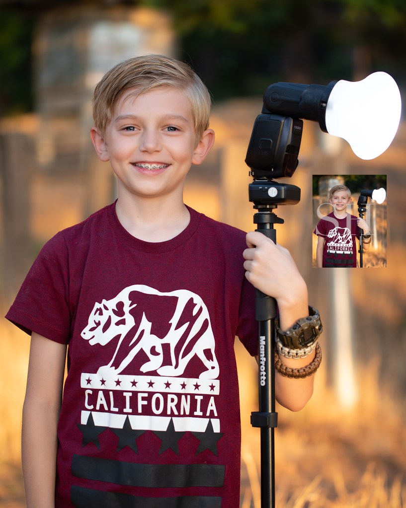
Can you even find that tiny proof in there?! It’s right below the flash on the right.

This really shows the staggering difference in quality between the different image resolutions. 4×6 digitals are about 25% original size; 5×7 are about 35%; and 8×10 are about 50%. Full resolution images print beautifully at any size, and still look impeccable at 100% zoom. They preserve every detail exactly the way it was finished in my studio.

Black And White: Actually a Grey Area.

Sometimes I include black and white images in my client galleries, and they are often duplicate edits of shots I’ve shown in color. Since most printing services give an automatic black and white conversion option, it may seem unnecessary for me to include these alternate edits. But this is far from the case, and I want to show you how that’s so.

Left: Automatic conversion to black and white from color
Right: hand-process of a black and white conversion
Original color image

Black and white filters don’t know what you want the image to be about. There are a lot of neat looking effects readily available through Instagram, VSCO, and other plugin sources; but those one-and-done tools don’t understand what is important in the image, and what can be downplayed or augmented to make the subject really pop.

If you desaturate an image and make no other changes, certain details that stood out because of their color will be diminished or lost in your black and white image. Although the colors may have been in great contrast, they may also be very similar in tone. Converting an image like that to black and white can make it all a muddle of similar shades of gray.

A successful, eye-catching black and white image needs to have bright whites and rich darks. It needs to have its subject clearly defined so that even if it’s printed the size of a postage stamp, the subject matter is clear and readable.

Automatic conversion by desaturation–the subjects blend with the background for lack of contrast.

The images I’ve included show the progression an image can take from color to black and white. In the color version, the pink and blue clothing easily sets the family apart from the beautiful greenery in the background. But when I automatically convert the image to black and white (by desaturation), the family seem to merge with the background. Their prominence in the frame is really diminished. Alternately, in my hand edit, I’ve manipulated the light and shadow values to bring the family back out of the background and make them the stars of the show again.

Color spoils easily. The vibrant, on-trend color that makes you love an image today can also make it look dated in 7 or 8 (or 20?) years. Color is very susceptible to the changing tides of fashion, so if there’s a lot of bold color in a shot, that can be a really good reason to also have a black and white edit. Without the element of color, images can transcend time more freely and endure more without the connotation of any particular era. On the other hand, there’s a valid and joyous place in the world for all that is of this very moment and will no longer make sense to us 6 months or a year from now. “Now” and “Always” are equally precious.

Custom hand-conversion from color to black and white–a dark background contrasts strongly with well-lit subjects, and the tones in the clothing are varied.

So, automatic black and white conversion is not available in my product line. I encourage my clients to reach out to me personally for their black and white conversions so they can get a black and white image that is every bit as thoughtfully created as the color version.