Editorial.

I’ve been obsessed with editorial fashion photography all my life. Bold, fearless photographers like Helmut Newton and Annie Liebovitz captivated my imagination. I was so drawn to the sprezzatura–the effortlessness of their work. It was so peculiar, so edgy or intense, yet looked like it happened that way naturally. It seemed like those photographers were just always in the right place at the right time.

Muse: Allyson Parr

Although the style of my work is night and day from hers, Lindsay Adler’s ethos really resonates with me, and I’ve spent many hours studying her photography lectures. In one of her classes, she mentioned scheduling a creative day once a month to shoot something that is not for clients, but develops your own concepts and creates the type work you really want to sell.

At first it felt indulgent to set “work” aside and plan something elaborate for myself, but I’ve come to realize it’s not just for fun–it’s an investment in my professional development and my brand.

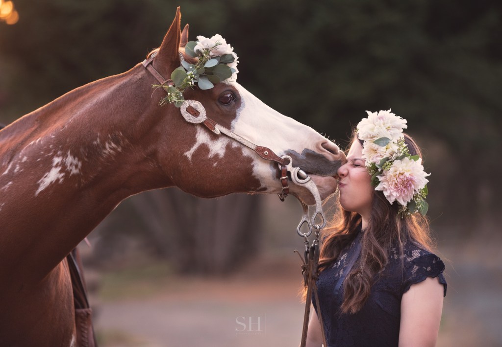
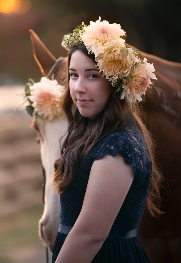
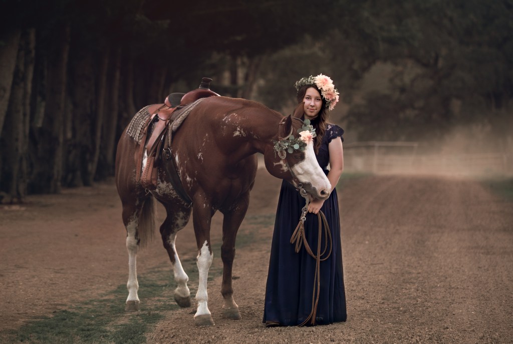
As an artist, I’ve found my most inspired work comes when I collaborate with others. I have a long bucket list of fellow creative professionals whose work sparks my soul. For my last concept shoot, I teamed up with Molly Allen of Made in Amador, who designed a pair of bold dahlia and eucalyptus crowns for my muse and her horse. Made in Amador floral designs have that sprezzatura I love. Molly colors outside the lines. Her pieces have a certain wild abandon to them, yet they always feel balanced and down to earth. Nothing could have brought my vision together more perfectly.

As my business grows ever more booked and my own concepts develop further, I realize it’s quite an effort to put together a styled photoshoot! Although I haven’t hit the once a month mark this year, I I’ve been incredibly energized and inspired by the editorial work I’ve done and I can’t wait to start planning my next project.

Black And White: Actually a Grey Area.

Sometimes I include black and white images in my client galleries, and they are often duplicate edits of shots I’ve shown in color. Since most printing services give an automatic black and white conversion option, it may seem unnecessary for me to include these alternate edits. But this is far from the case, and I want to show you how that’s so.

Left: Automatic conversion to black and white from color
Right: hand-process of a black and white conversion
Original color image

Black and white filters don’t know what you want the image to be about. There are a lot of neat looking effects readily available through Instagram, VSCO, and other plugin sources; but those one-and-done tools don’t understand what is important in the image, and what can be downplayed or augmented to make the subject really pop.

If you desaturate an image and make no other changes, certain details that stood out because of their color will be diminished or lost in your black and white image. Although the colors may have been in great contrast, they may also be very similar in tone. Converting an image like that to black and white can make it all a muddle of similar shades of gray.

A successful, eye-catching black and white image needs to have bright whites and rich darks. It needs to have its subject clearly defined so that even if it’s printed the size of a postage stamp, the subject matter is clear and readable.

Automatic conversion by desaturation–the subjects blend with the background for lack of contrast.

The images I’ve included show the progression an image can take from color to black and white. In the color version, the pink and blue clothing easily sets the family apart from the beautiful greenery in the background. But when I automatically convert the image to black and white (by desaturation), the family seem to merge with the background. Their prominence in the frame is really diminished. Alternately, in my hand edit, I’ve manipulated the light and shadow values to bring the family back out of the background and make them the stars of the show again.

Color spoils easily. The vibrant, on-trend color that makes you love an image today can also make it look dated in 7 or 8 (or 20?) years. Color is very susceptible to the changing tides of fashion, so if there’s a lot of bold color in a shot, that can be a really good reason to also have a black and white edit. Without the element of color, images can transcend time more freely and endure more without the connotation of any particular era. On the other hand, there’s a valid and joyous place in the world for all that is of this very moment and will no longer make sense to us 6 months or a year from now. “Now” and “Always” are equally precious.

Custom hand-conversion from color to black and white–a dark background contrasts strongly with well-lit subjects, and the tones in the clothing are varied.

So, automatic black and white conversion is not available in my product line. I encourage my clients to reach out to me personally for their black and white conversions so they can get a black and white image that is every bit as thoughtfully created as the color version.