What is the recipe for great image quality? How do you know it when you see it? I’ll be writing a series of posts over time to delve into this in a way anyone can understand. The short answer? Great images are made by leveraging adept knowledge on powerful equipment to uplift free-spirited creativity.
I want to take a little time to explain some different aspects of image quality in a way that’s not too technical for non-photographers to follow.
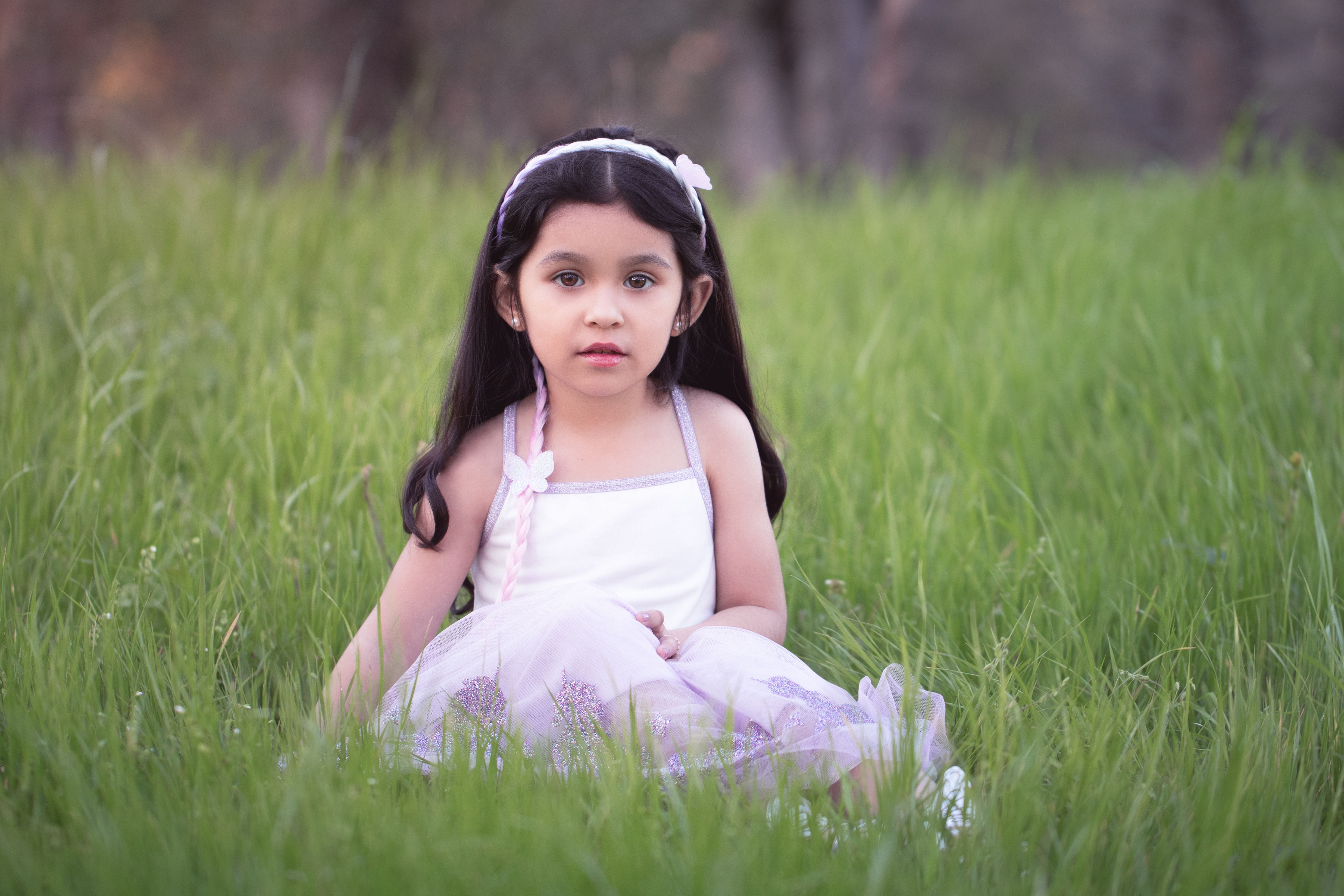
The low-quality samples in my proofing don’t show the depth of detail in the final images. That’s part of the reason I’m writing this post! The image quality I explain here is the image quality you can expect from every one of my galleries. I work in accordance with the standards established for commercial photography by Adobe Stock and Getty Images, and branch out artistically from that starting point. If for some reason I ever couldn’t deliver that on a session, I would offer a complimentary reshoot rather than deliver those images.
Exposure Issues
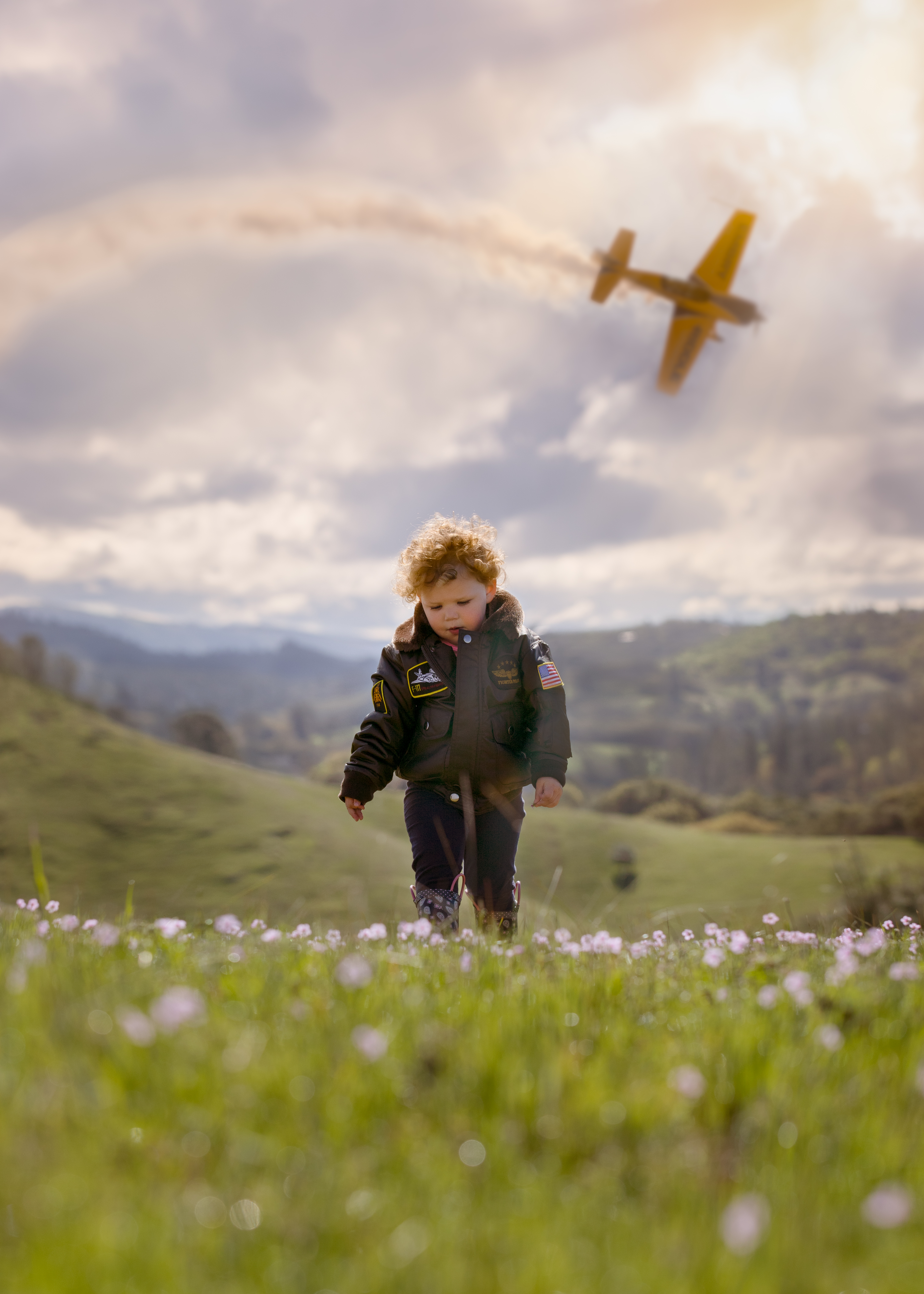
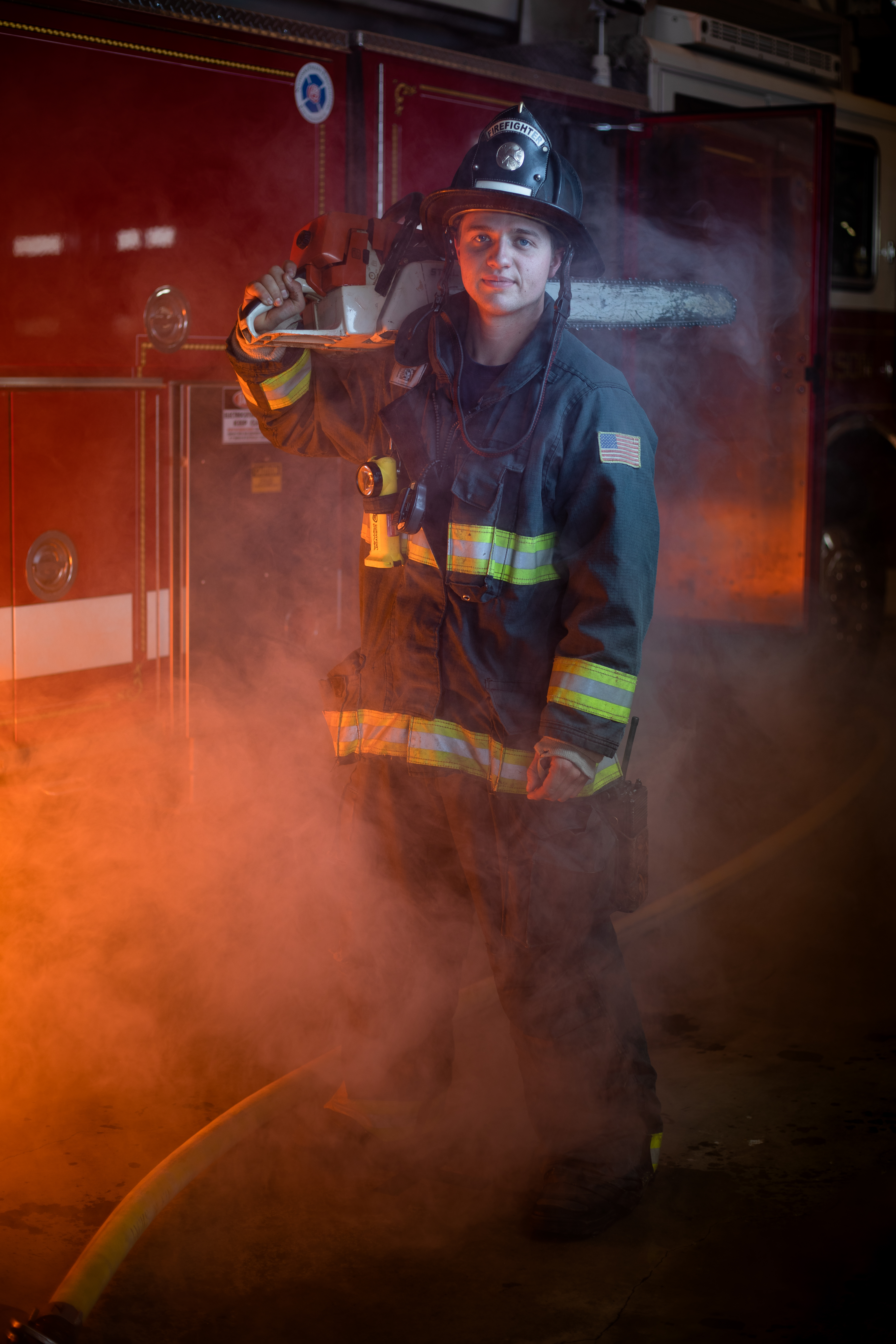
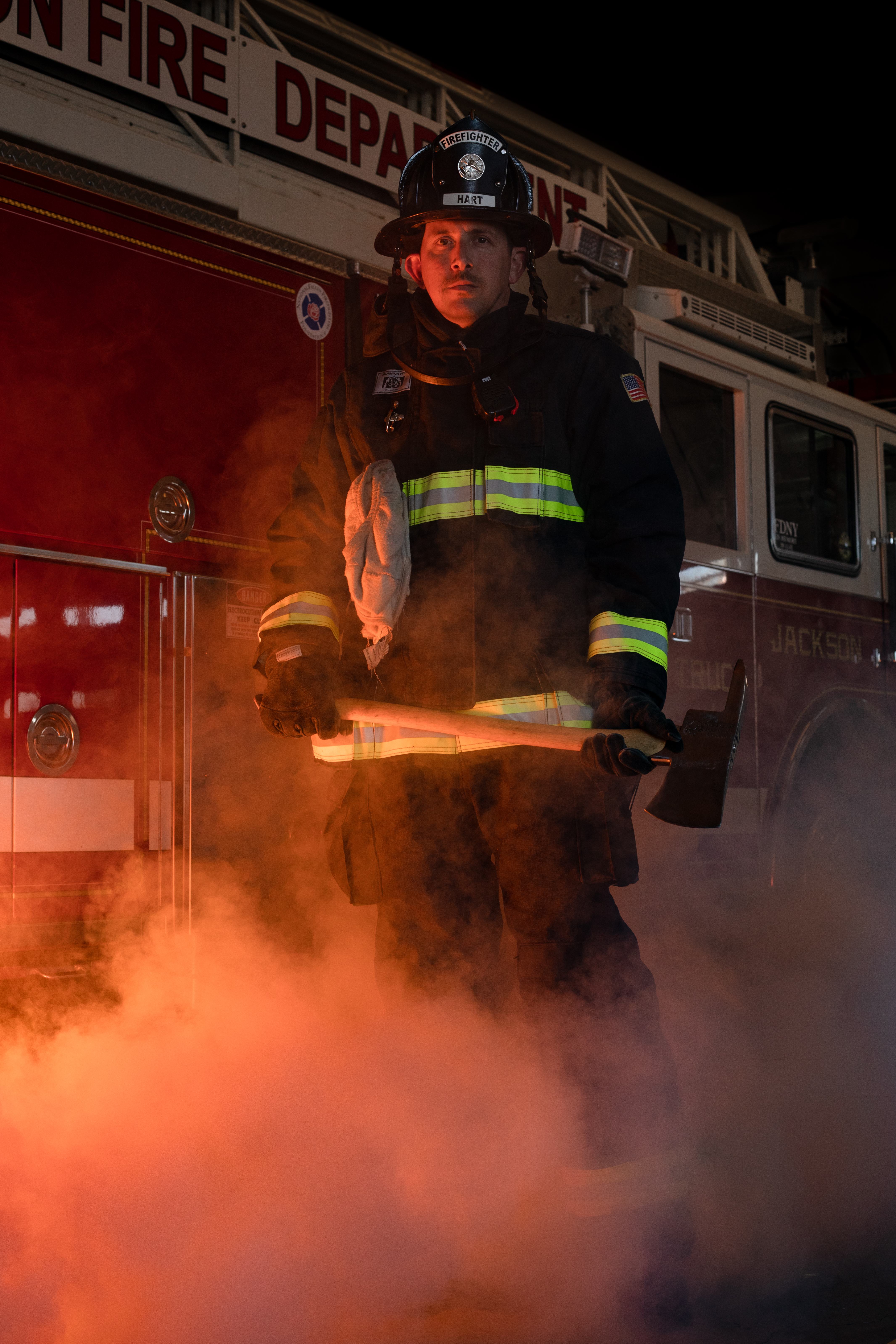
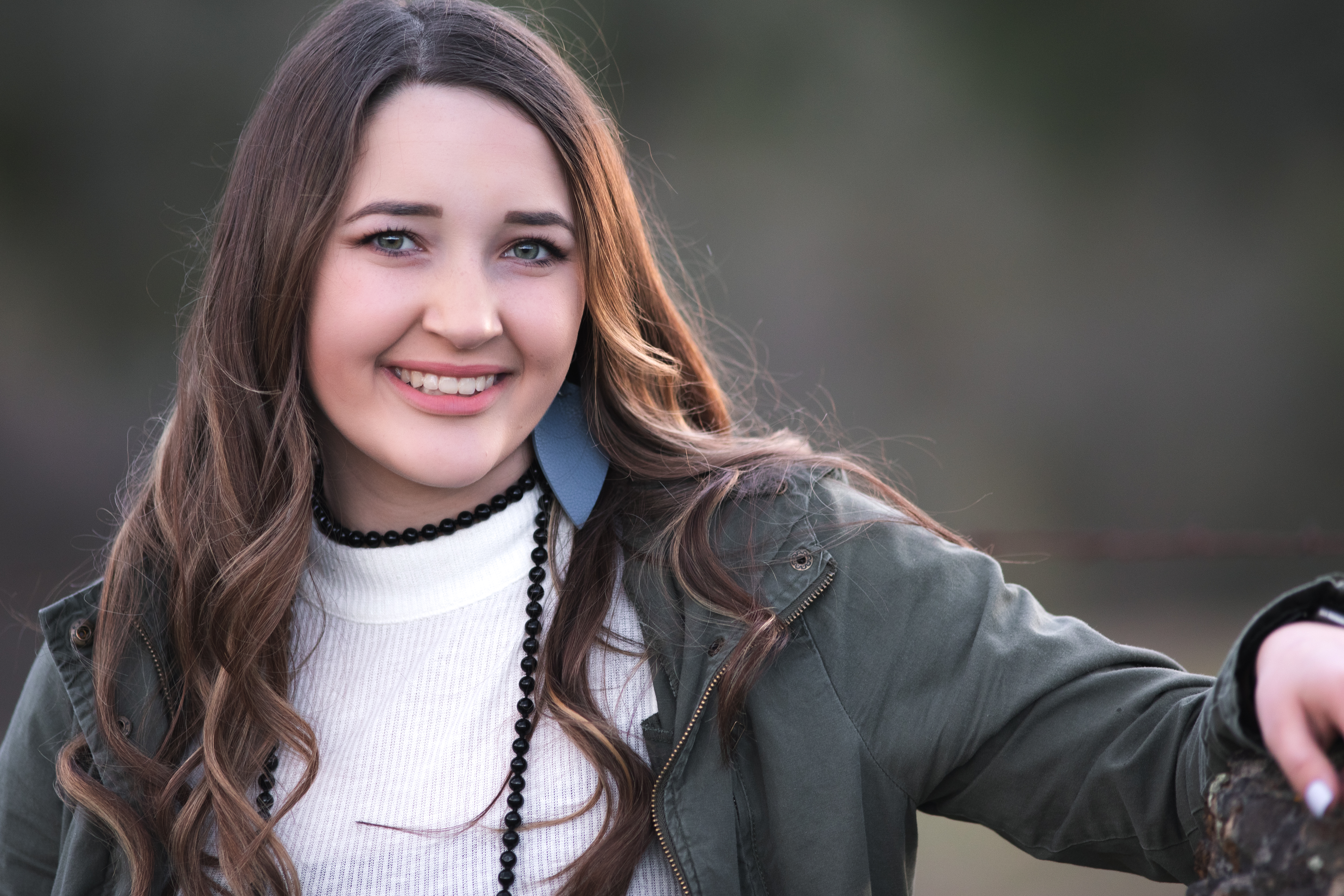
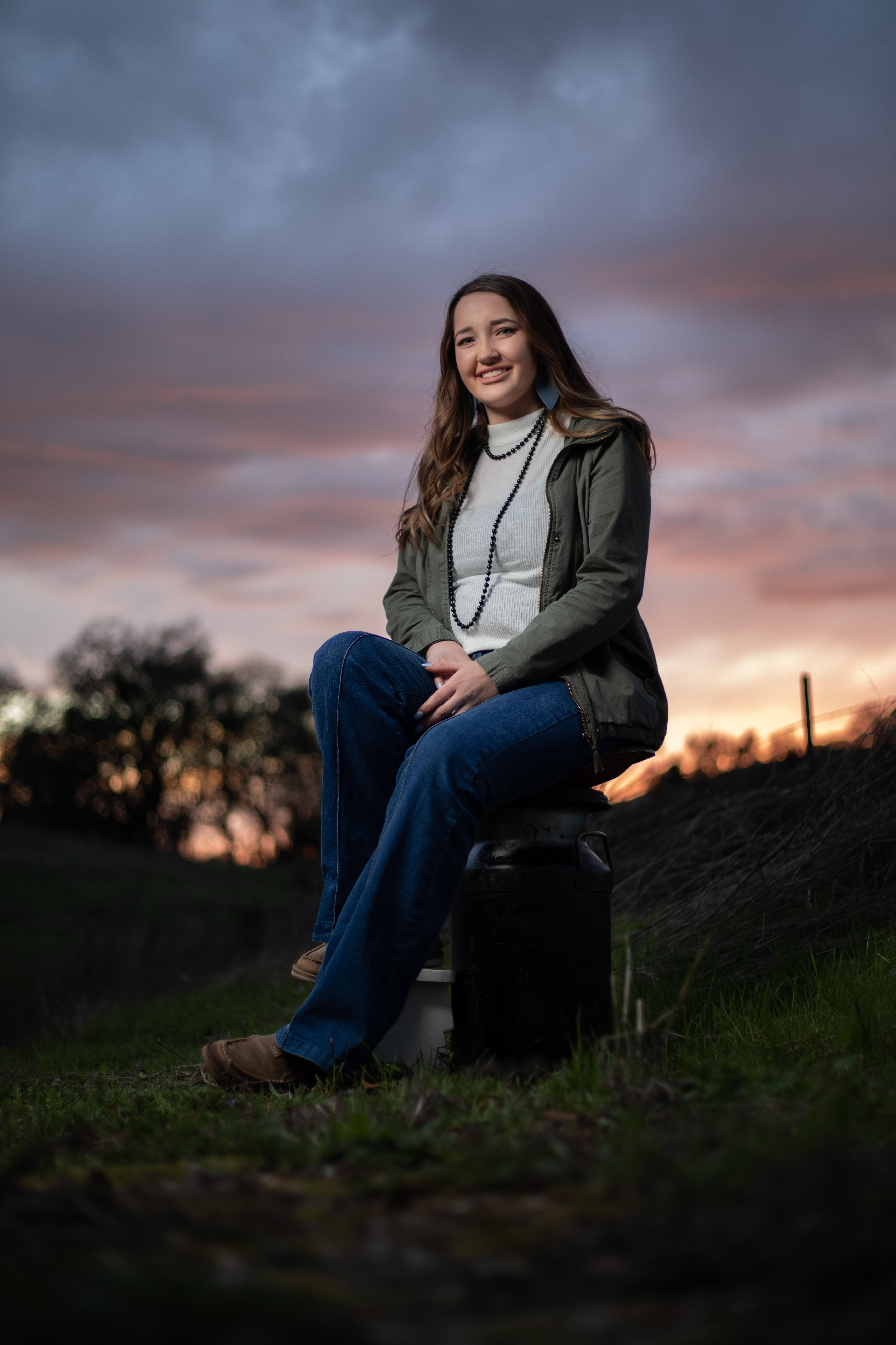
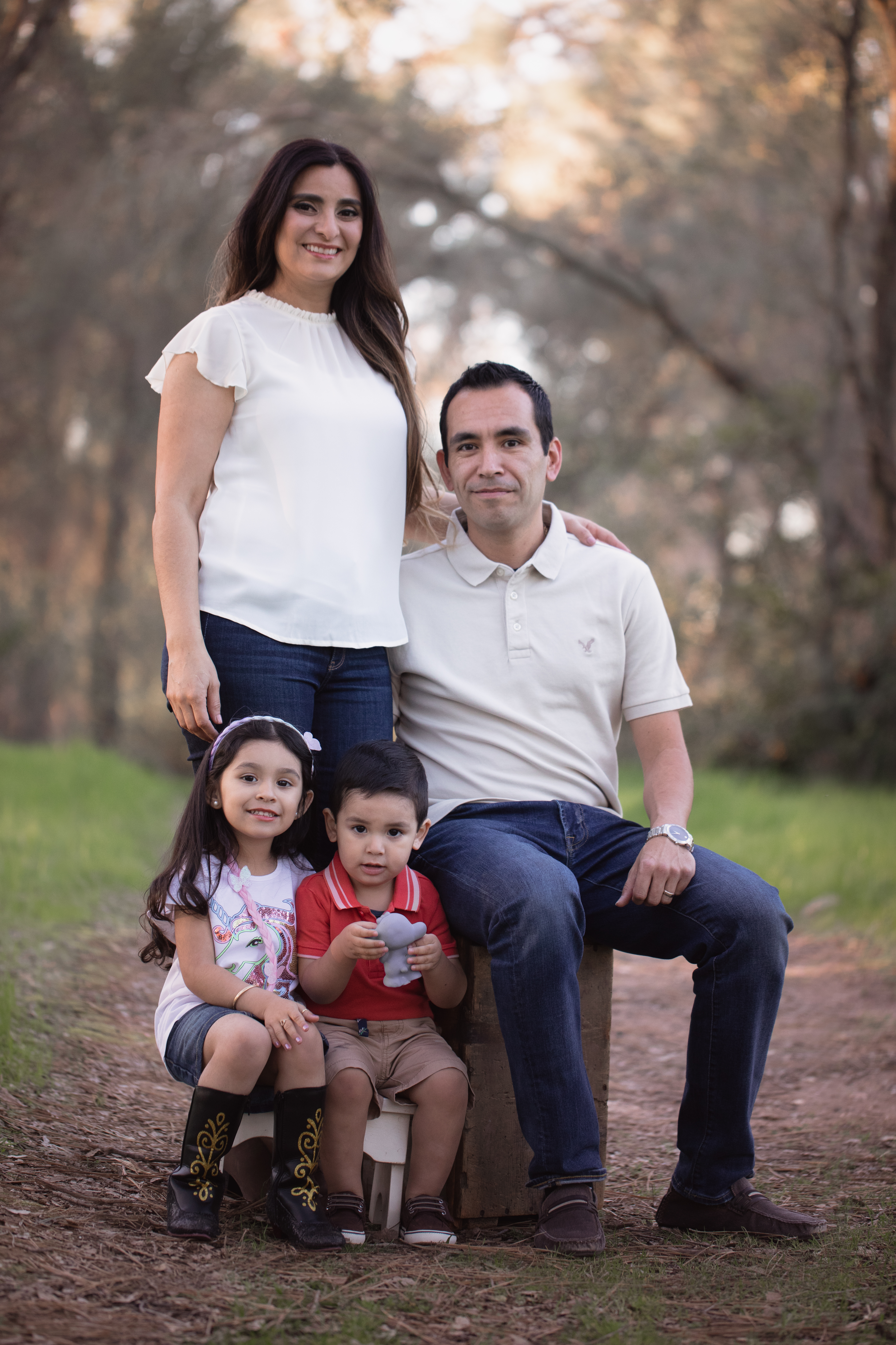
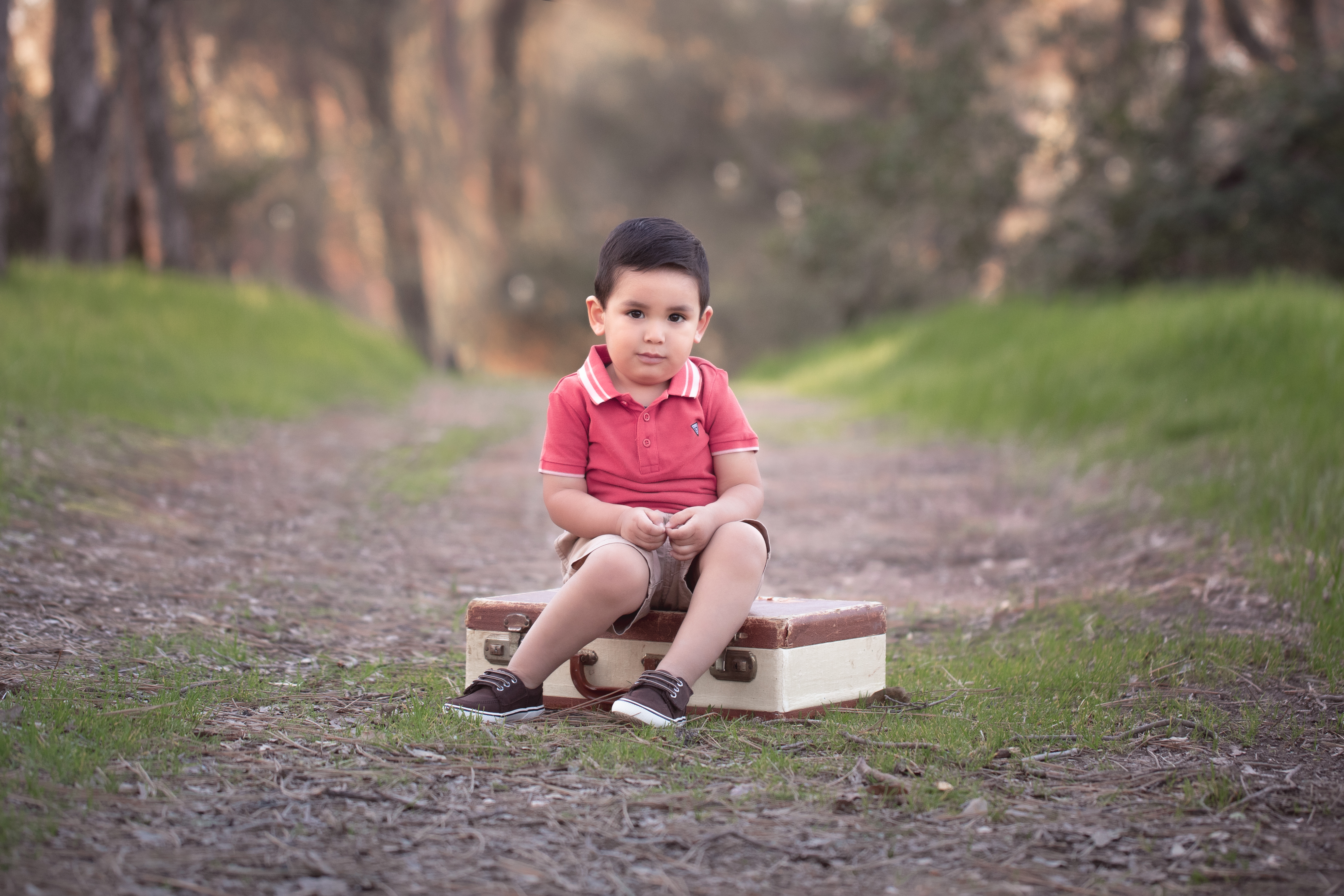
There are many factors that make up the prevailing assessment of image quality. In portraits, focus should be sharp on both eyes. Exposure should be correct. The image should be free of excessive artifacts like noise, dust, chromatic aberrations, and color separation. There are times to break the rules, and I’m happy to do it for good reason. But quality standards exist to help us create the most rich, real, and beautiful images the state of our art will allow.
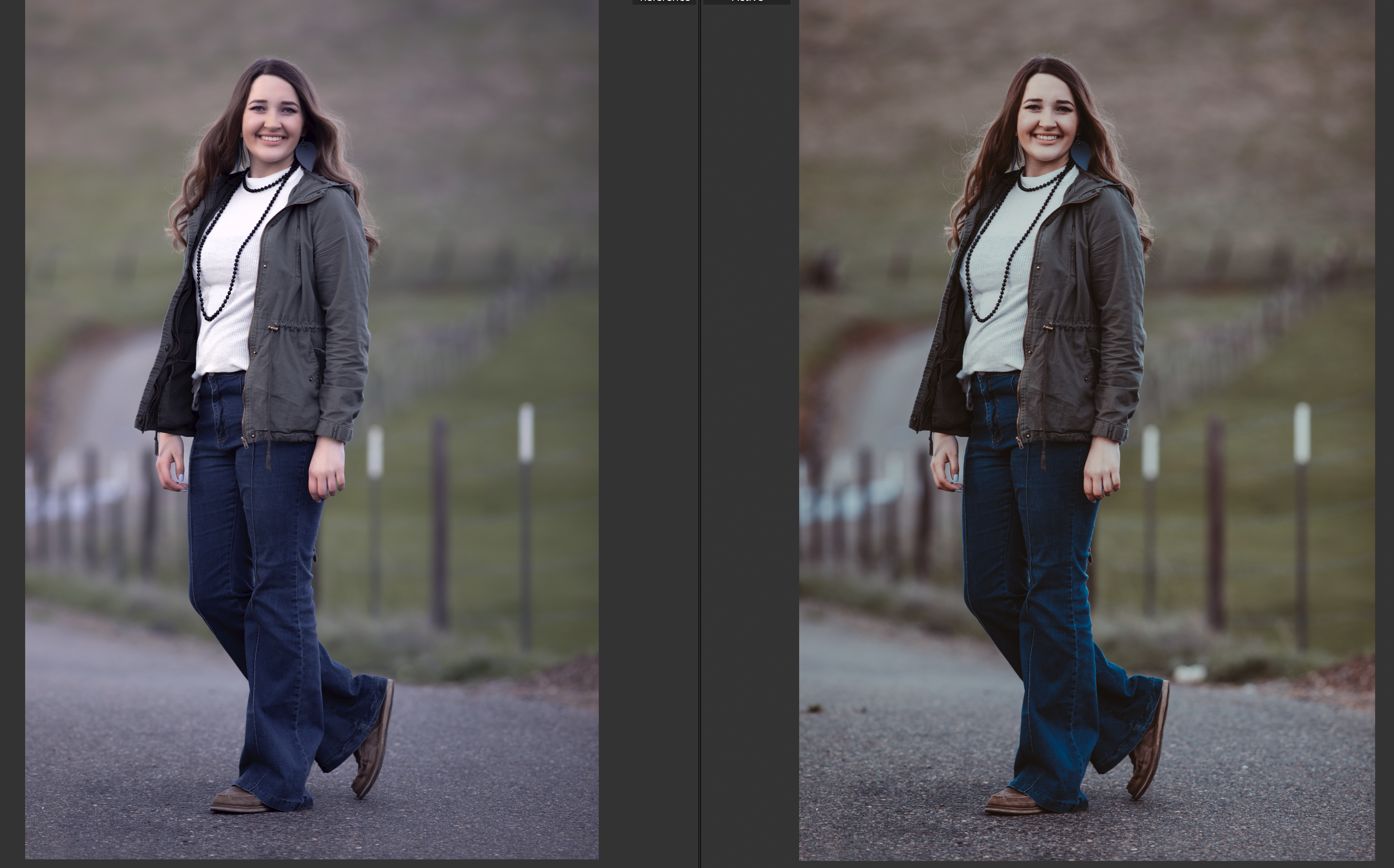
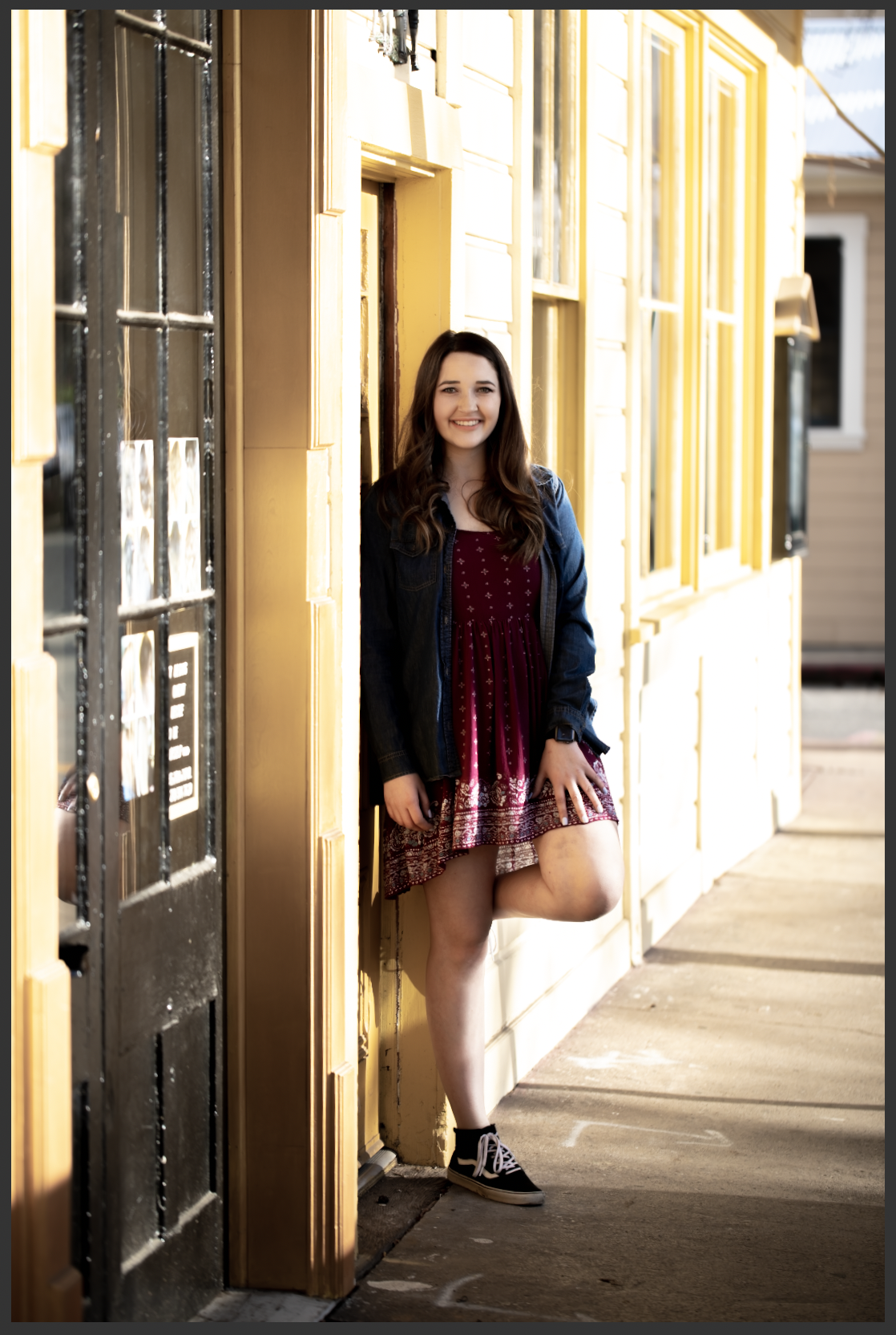
To put it more plainly, here’s a poor quality image. The highlights are clipped–see how the side of the building is white where it seems like it should probably be yellow? Those parts of the image are so overexposed that the camera’s sensor recorded no detailed data. The same thing happened in the shadows here. There are no details in the blacks.
It’s kind of like when you walk into the sun from a dark room and you can’t see anything until your eyes adjust. You’re not capable of seeing both the extreme dark and the extreme light at the same time–you have to adjust for one or the other. In the same way, this scene went outside the range of what my camera could capture.
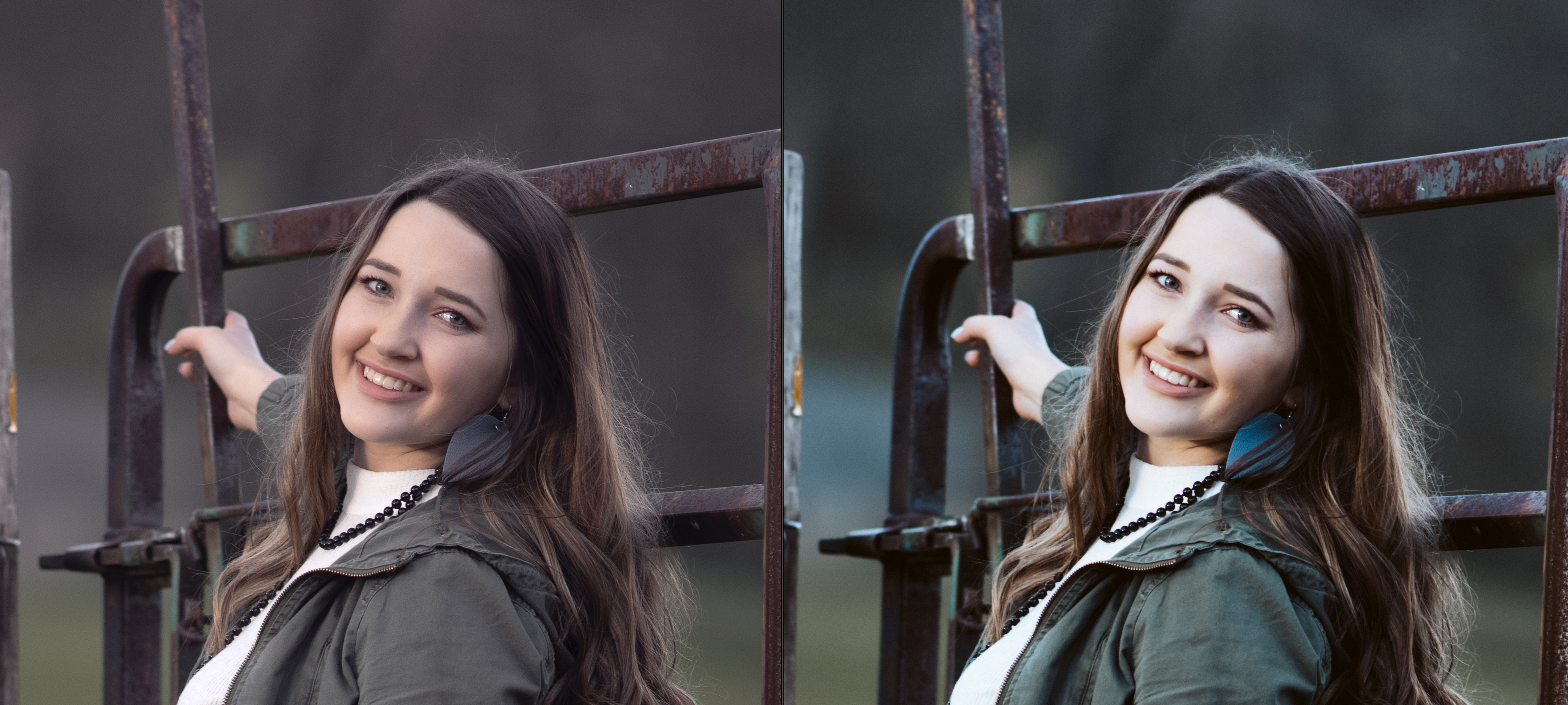
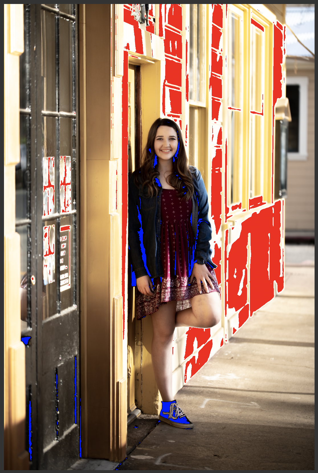
The next image shows what the same shot looks like to me when I’m processing. The red is Lightroom’s highlight clipping indicator, and the blue is the shadow clipping indicator. I don’t turn these indicators off when I’m working. A quality image should look identical whether they are on or off.
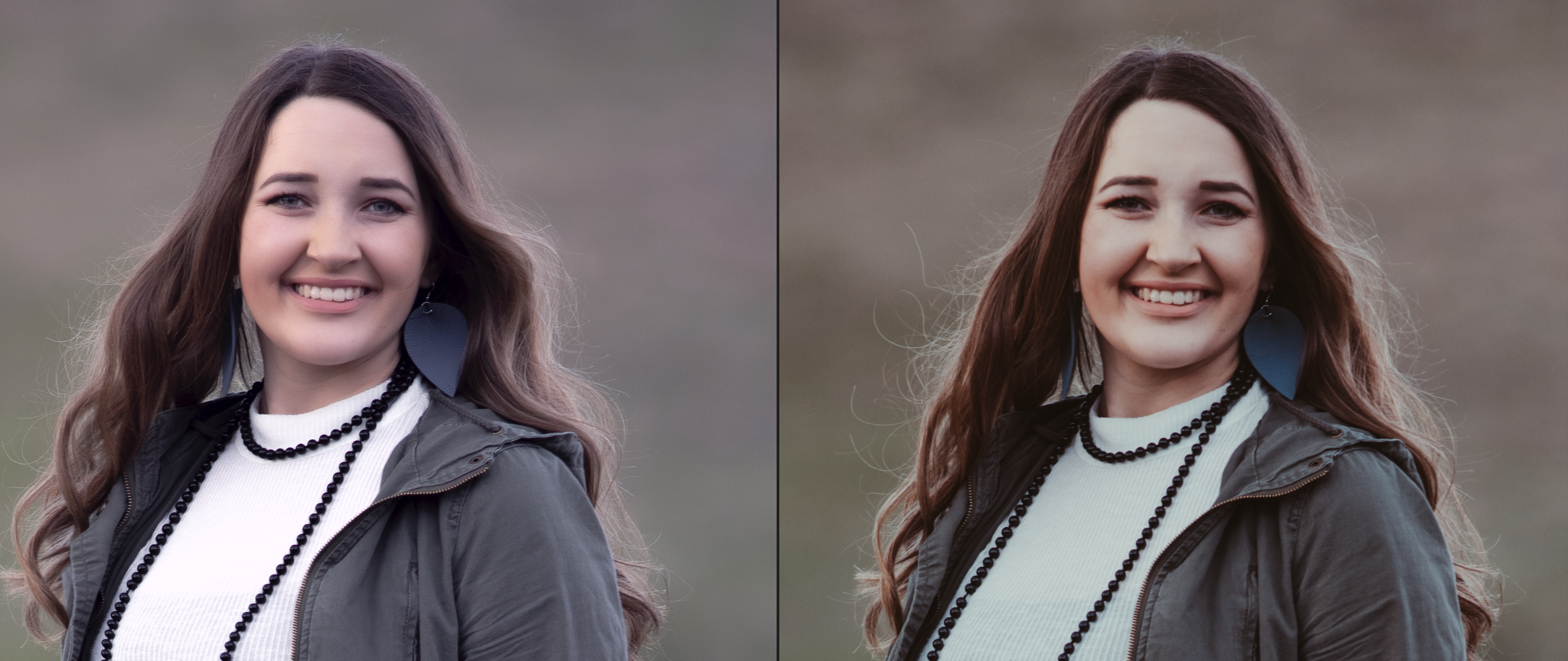
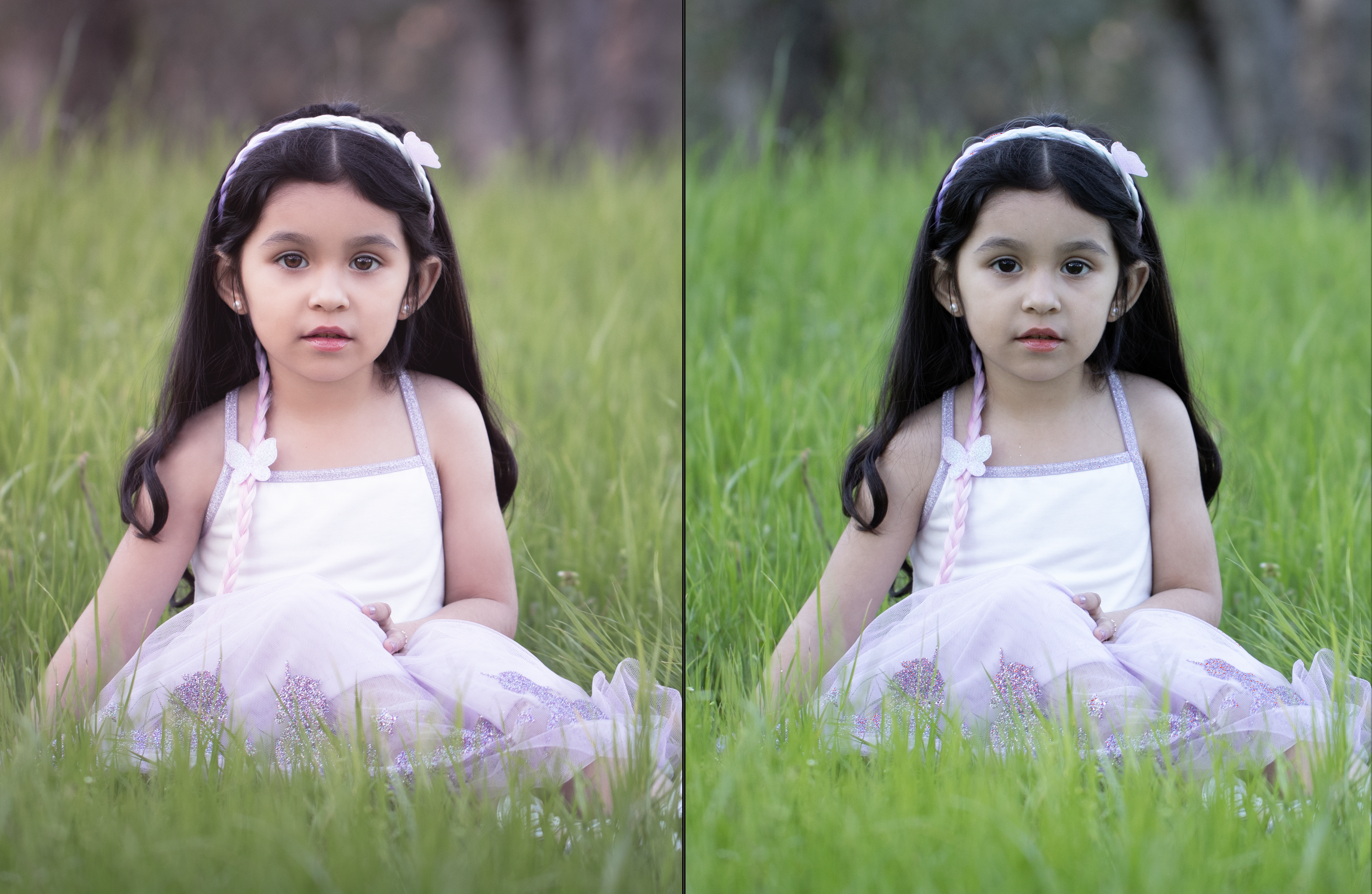
I’ve also shared an example of a successful image side by side with the clipping indicators on and off. There’s no difference between the with and without indicator images. Even though this image was also shot in dramatic light, there is no clipping anywhere–detail was captured throughout the entire frame.
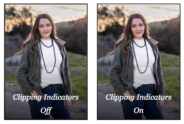
The takeaway is that protecting the quality of the entire frame is essential to making the most beautiful image possible.
Professional photographers not only recognize image quality issues, but they also have in-depth technical knowledge of the equipment they use, and are able to push its capabilities to the limits–or even beyond, with a measure of ingenuity and strong post-processing skills.