Amador County, California photographer Sarah Hart writes about photography, from demystifying technical concepts to communicating the human condition through art.
Image resolution, aspect ratio, and file size can be confusing. This guide will use examples to help you understand what it means when a digital image has a description like “4×6 resolution” or “full resolution.” I’ll also explain how print sizes differ, and how different aspect ratios can change the look of an image.
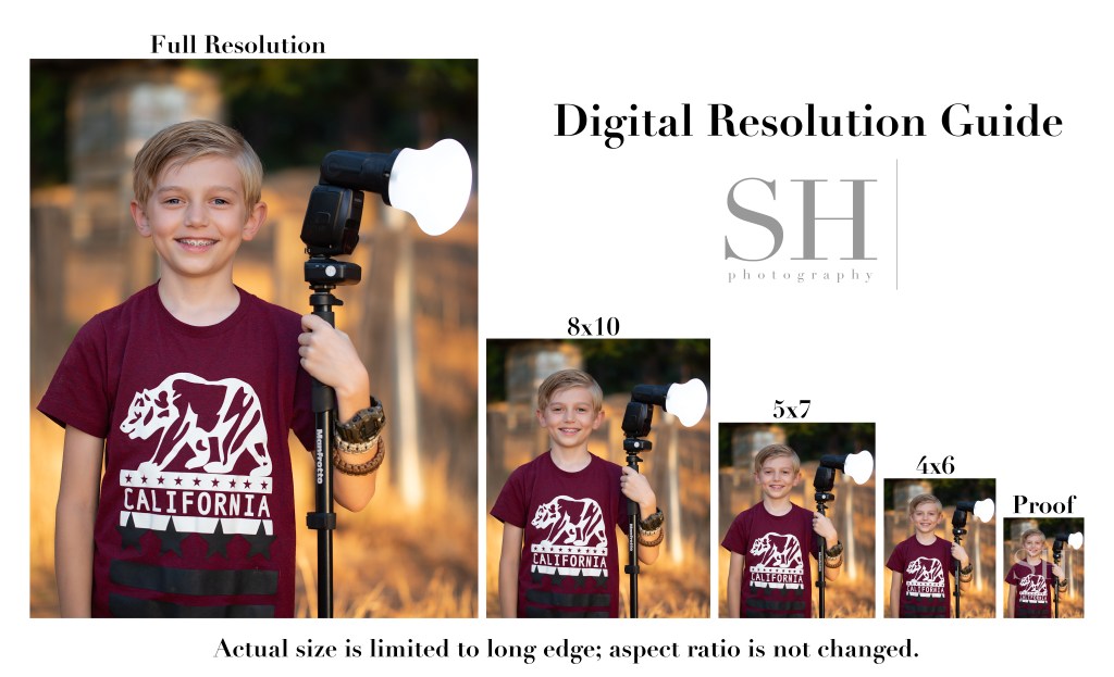
This Digital Resolution Guide shows each of the digital resolutions I offer my clients. Note that for digital files, I don’t change the shape of the image to match the exact proportions of the standard print size; I simply resize the image based on the long edge and leave the original aspect ratio (shape) intact.
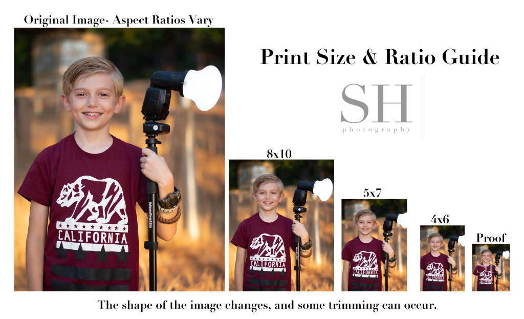
Compare this to the Print Size & Ratio guide. You’ll notice that with prints, it’s not only the size, but also the shape, or aspect ratio, of the image that changes. An 8×10 print is more short and stout in shape than a 5×7, and a 4×6 is the most tall and skinny of all.
Although my camera natively shoots in a 4×6 (2×3) ratio, the actual aspect ratio of the images will vary based on how they’re finished. When printing, always check the crop of your images to make sure the necessary trimming looks ok. You might need to choose a different size print to get the best look from your image.
The proofs you see in my proofing galleries are the smallest versions of all–just about 18% of the original file size. Low-resolution proofs allow clients to preview their images before purchase while protecting my investment in my work. Here’s a direct comparison of a proof and a full-resolution image.
Can you even find that tiny proof in there?! It’s right below the flash on the right.
This really shows the staggering difference in quality between the different image resolutions. 4×6 digitals are about 25% original size; 5×7 are about 35%; and 8×10 are about 50%. Full resolution images print beautifully at any size, and still look impeccable at 100% zoom. They preserve every detail exactly the way it was finished in my studio.
“Never work with kids or animals”…said so many people, always, forever…..
But kids are my wheelhouse, and there’s nothing cuter than kids with animals! I see their point, though. Kids=chaos. Animals=chaos. Kids x Animals = whoa…….
Sessions with kids and animals can be super cute and fun! For little kids though, it can end up being more of a lifestyle session than portraits. That’s fine if it’s what you’re after! I’ve been enjoying doing some animal composites this season though, and I’m finding the results are sometimes a bit more magical than the real deal could have been.
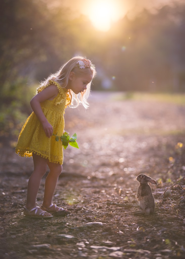
Could this kind of calm, thoughtful interaction really happen outside of fairy tales–no less in front of an audience of kindly coaching parents and an imposing camera lens?
I shared this image (the girl in the yellow dress) on the Relish Facebook page, and I received a handful of requests for similar shoots. Folks were disappointed when I told them, “yes we can do this, but just so you know, there wasn’t really a bunny at the shoot!” I get it–it’s a super cute thought to see your kids get to play with a real bunny and have pictures of that. But in reality, that situation can be more stressful than cute. A real bunny can easily get scared and run away. She needs careful, gentle treatment, and may get nervous and nibble fingers or have an accident on that beautiful little dress. When real animals are in the shoot, I find that tensions can run high.
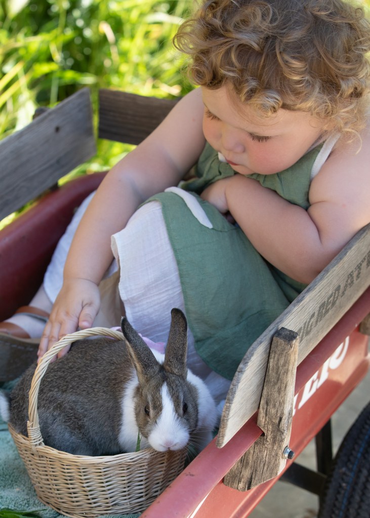
With a real bunny, we had to be confined to make sure she didn’t get lost, and both bunny and child were in constant motion. Daddy was trying to keep Evi from standing up and the bunny from jumping out of the wagon.
My daughter got a bunny this spring and I wanted to do a photoshoot for Easter. I made a nice flat spot in a grassy planter for her to hold the bunny. I set up my reflector. But I put her in the grass and she pitched a fit. She didn’t want to sit in the planter. The bunny climbed up the grass and wanted to chew on the tree bark. It was not picturesque. Plan B was putting them both in the wagon–not my vision for a nice color palette, and I had to quickly improvise the backdrop by changing my angle to something less than ideal. The bunny ate grass, and Evi petted her. It was cute. Super cute.
But these shots have barely a hint of the aura of wonder I was able to create in that first image, where I didn’t have to worry about the bunny escaping, and the little girl could be given a simple task without being distracted by the erratic activity of a live animal.
I asked that sweet little girl to look for ants in the bright yellow leaves that the sun was backlighting. She was calm. It was mellow. When I got home, I saw that shot and thought “that’s a perfect spot for a bunny!” …I had a perfect pose from her, and I was able to blend in a bunny in a perfect pose, in a perfect position.
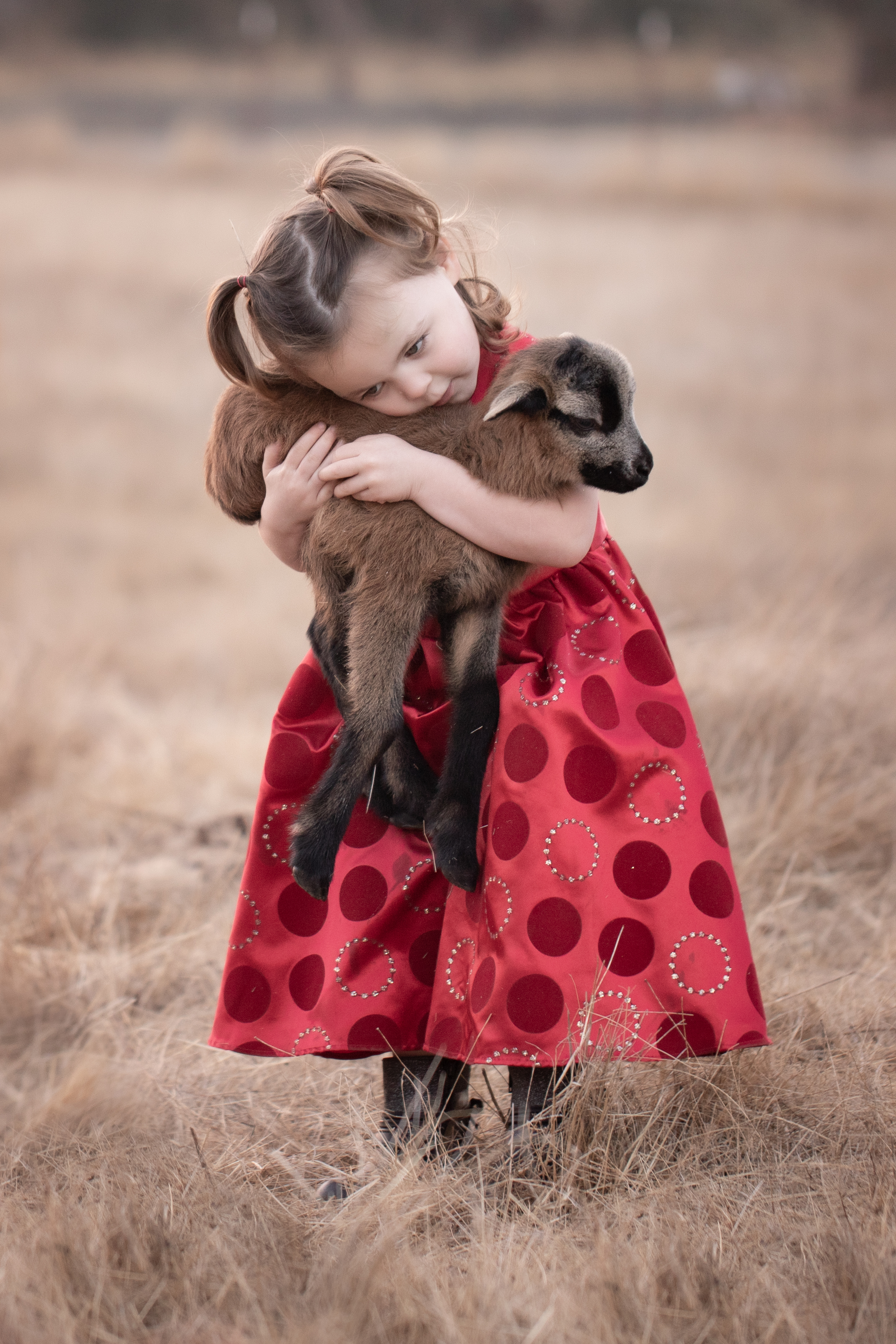
I love this lifestyle image of a little girl with her new baby sheep. Images like this have more of a documentary feel, and are a lot more difficult to achieve with smaller animals.
So… yes, we could bring a bunny out for little kids’ sessions. I do have a real bunny, and she’s super sweet and friendly. But it wouldn’t be very fair to that timid little creature. The reality of live animals in a session is a lot more chaotic and less picturesque than it plays out as in the mind’s eye. I’m not saying I’ll never do it–I gladly will any time if folks have their own animals they’d like to include! But to make something like the really magical composite above, I need to be able to have more control than a real “kids x animals” experience can usually give.
Even when the animal really was at the session, those shots are also often composites. The animal and the child so rarely do the right thing at the same time that I often blend multiple shots to create one final image. With over 20 years’ experience with Photoshop and photography, I can create a full composite that is even more magical, and nobody has to get tinkled on.
What is the recipe for great image quality? How do you know it when you see it? I’ll be writing a series of posts over time to delve into this in a way anyone can understand. The short answer? Great images are made by leveraging adept knowledge on powerful equipment to uplift free-spirited creativity.
I want to take a little time to explain some different aspects of image quality in a way that’s not too technical for non-photographers to follow.
The low-quality samples in my proofing don’t show the depth of detail in the final images. That’s part of the reason I’m writing this post! The image quality I explain here is the image quality you can expect from every one of my galleries. I work in accordance with the standards established for commercial photography by Adobe Stock and Getty Images, and branch out artistically from that starting point. If for some reason I ever couldn’t deliver that on a session, I would offer a complimentary reshoot rather than deliver those images.
Poor Quality: Background Exposure Issues
There are many factors that make up the prevailing assessment of image quality. In portraits, focus should be sharp on both eyes. Exposure should be correct. The image should be free of excessive artifacts like noise, dust, chromatic aberrations, and color separation. There are times to break the rules, and I’m happy to do it for good reason. But quality standards exist to help us create the most rich, real, and beautiful images the state of our art will allow.
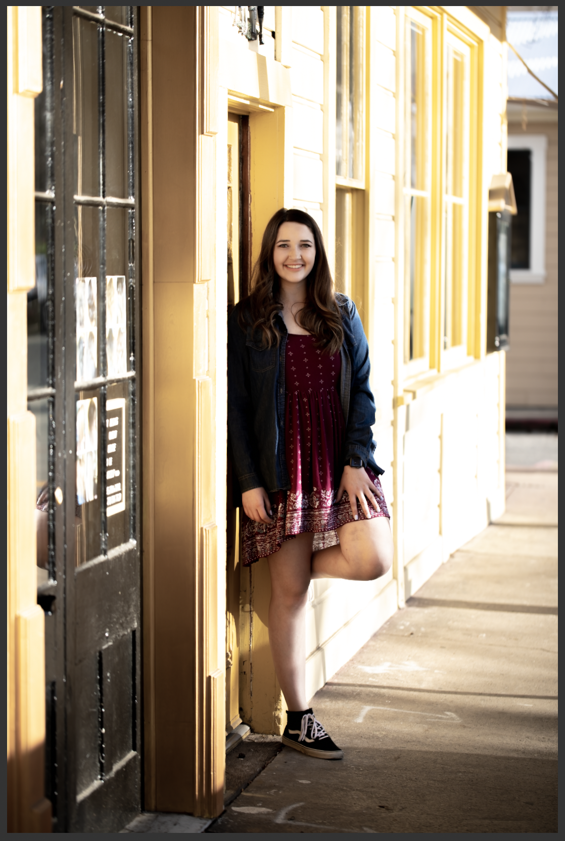
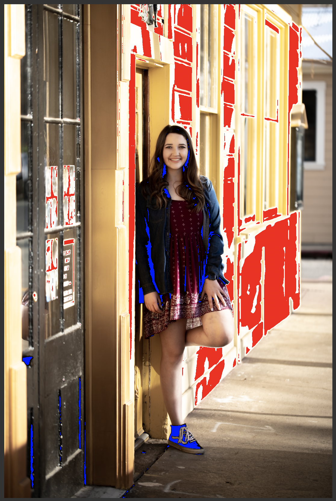
To put it more plainly, here’s a poor quality image. The highlights are clipped–see how the side of the building is white where it seems like it should probably be yellow? Those parts of the image are so overexposed that the camera’s sensor recorded no detailed data. The same thing happened in the shadows here. There are no details in the blacks.
Highlight Clipping: BIG RED NO!
It’s kind of like when you walk into the sun from a dark room and you can’t see anything until your eyes adjust. You’re not capable of seeing both the extreme dark and the extreme light at the same time–you have to adjust for one or the other. In the same way, this scene went outside the range of what my camera could capture.
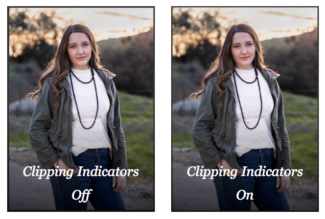
The next image shows what the same shot looks like to me when I’m processing. The red is Lightroom’s highlight clipping indicator, and the blue is the shadow clipping indicator. I don’t turn these indicators off when I’m working. A quality image should look identical whether they are on or off.
I’ve also shared an example of a successful image side by side with the clipping indicators on and off. There’s no difference between the with and without indicator images. Even though this image was also shot in dramatic light, there is no clipping anywhere–detail was captured throughout the entire frame.
The takeaway is that protecting the quality of the entire frame is essential to making the most beautiful image possible.
Professional photographers not only recognize image quality issues, but they also have in-depth technical knowledge of the equipment they use, and are able to push its capabilities to the limits–or even beyond, with a measure of ingenuity and strong post-processing skills.